TL;DR

Get audio and creator gear delivered free with Prime
- Fast, free delivery on millions of items
- Prime Video, Amazon Music and more included
- Member-only deals all year
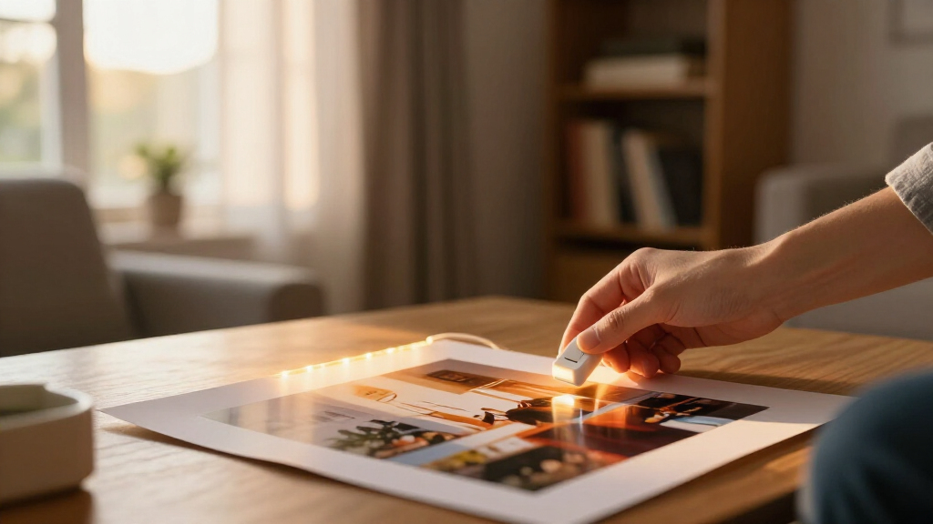
The best display lighting for prints at home is a dimmable 90–95+ CRI LED at 2700–3500K, aimed from above at roughly a 30-degree angle with a beam wide enough to cover the whole print. Fading is caused by cumulative light exposure measured in lux-hours, so brightness and time-on matter as much as UV. Never place valuable prints in direct sunlight, even behind UV-filtering glass.
The first print I ever sold came back to me eighteen months later, washed out and ghostly. The buyer had hung it in a bright south-facing hallway, framed it properly, even paid extra for UV glass. None of that saved the magentas. The blues had gone chalky, the blacks had lifted, and there was nothing to do but reprint it — a favor I could extend once, but not for a limited edition.
That lesson stuck: good print lighting must balance three goals — accurate color, attractive presentation, and protection from fading. Miss any one of them and you either have a beautifully lit print that’s quietly dying, or a perfectly preserved print that looks flat and gray on the wall.
Here’s what I’ll walk you through: why light damages prints in the first place, why the best solution is usually a quality LED fixture, how to pick color temperature and color fidelity without falling for marketing labels, and exactly how to aim a light so your print glows instead of glaring. I shoot and print for a living. Everything here comes from prints I’ve made, hung, ruined, and rescued.
Aim for a dimmable 90–95+ CRI LED at 2700–3000K (up to 3500–4000K for contemporary work), positioned above the print at a 30-degree angle.
Fading is cumulative — measured in lux-hours — so brightness and hours-on matter as much as UV; UV-filtering glass does not make direct sunlight safe.
Glare is a geometry problem: find what the glazing reflects from your normal viewing position, then move the light or the reflection source.
Match color temperature across all fixtures on a gallery wall before fine-tuning anything else.
Treat pigment inkjet and silver-gelatin prints as tough, dye-based and chromogenic prints as fragile — and rotate or dim anything irreplaceable.
Display Lighting for Prints at Home
The best display lighting for prints at home is a dimmable 90–95+ CRI LED at 2700–3500K, aimed from above at roughly a 30-degree angle, with a beam wide enough to cover the whole print. Fading is caused by cumulative light exposure measured in lux-hours — brightness and time-on matter as much as UV. Never place valuable prints in direct sunlight, even behind UV-filtering glass.
Museums display highly light-sensitive works on paper at around 50 lux, for limited periods. Even curators treat visible light itself — not just UV — as the fading culprit.
Key InsightThree Goals. Miss One and Something Breaks.
Accurate Color
High CRI with strong red rendering (R9) reveals true ink, paper tone, and shadow detail. Cheap LEDs turn reds muddy and skin tones dead.
Attractive Presentation
The right temperature, even coverage, and no glare make a print glow. A narrow beam that misses the lower corners distorts the whole image.
Protection from Fading
Damage is cumulative in lux-hours. Keep valuable originals dim, displayed intermittently, or rotated off the wall — like museums do.
Fading Is Math, Not Bad Luck
A print at 300 lux for four hours a day suffers roughly the same as one at 600 lux for two hours. There is no safe threshold — only slower or faster. UV-filtering glass removes ultraviolet radiation, but visible light also breaks down colorants. The sun pours through anyway.
Relative Daily Exposure (Lux-Hours)
Two very different days, identical cumulative damage. Brightness and time-on trade off one-for-one.
The LED Shopping Checklist, in Priority Order
LEDs beat halogen and incandescent outright for artwork on paper: less radiant heat, lower energy use, longer life, and negligible UV. Halogen picture lights dump infrared heat straight onto the print. But quality varies enormously — this is where cheap fixtures betray you.
CRI 90 Minimum — 95+ for Fine Art
Below that, reds go muddy and skin tones look dead. Treat “UV-free” and “museum-quality” labels as marketing, not proof.
Strong Red Rendering (R9)
The single most common weakness in budget LEDs. Look for a published, high R9 value before anything else on the box.
Consistent Color Across Fixtures
Two “3000K” lights from different makers rarely match. Buy from one reputable manufacturer that publishes actual color specs.
Low Flicker, Good Dimming
Dimming is essential — it’s your daily control over lux-hours. Flicker cheapens the viewing experience and hides shadow detail.
Wide, Even Beam Coverage
The beam must cover the entire image, including lower corners. Large works may need two overlapping beams or a wall washer.
Keep Heat Away from Artwork
LEDs run cooler, but fixtures still produce internal heat. Avoid mounting powerful lights extremely close to the print.
Pick the Kelvin That Fits the Print — and the Room
There is no universal “best” number. What matters most is harmony: mixing noticeably different color temperatures makes a display look inconsistent and accidentally cheap. Match temperature across every fixture on a gallery wall before fine-tuning anything else.
| Temperature | Character | Best For |
|---|---|---|
| 2700K | Warm, intimate | Traditional interiors, sepia-toned and warm-toned work |
| 3000K | Warm-neutral, versatile | ★ Most homes — the recommended default |
| 3500K | Clearer, neutral, not cold | Contemporary photography, cleaner color work — great for cool blues and greens |
| 4000K | Crisp, bright | Graphic and modern pieces — can feel clinical in warm rooms |
The 30-Degree Rule, Step by Step
Glare is almost always a positioning problem, not a lighting-quality problem. Glass and acrylic simply mirror bright sources toward the viewer — the glazing acts like a dull mirror. The fix is geometry.
Find the Reflection
Stand at your normal viewing position and identify what the glazing reflects — a window, a lamp, a white ceiling.
Aim From Above
Mount the fixture above and forward of the print, angled down at roughly 30 degrees to the artwork surface.
Clear the Path
Keep bright windows and bare lamps out of the reflection path. Move the light — or the reflection source.
Check Evenness
Confirm the beam covers the whole image including lower corners. Use a wider beam or two overlapping fixtures for large prints.
Tough Prints vs. Fragile Prints
Be honest about what’s on the wall. A replaceable poster can live under bright light — eventual replacement is the plan. A limited-edition print or a silver-gelatin photograph your grandfather made cannot.
- Pigment inkjet prints (archival pigment inks)
- Silver-gelatin black & white photographs
- Reproduction posters where replacement is acceptable
- Dye-based inkjet prints
- Chromogenic (C-type) color prints
- Limited editions and irreplaceable originals — rotate or dim
Why Your Print Is Fading (Even Behind UV Glass)
Prints fade because light damages paper, inks, and dyes cumulatively — and the damage depends on both brightness and time, often measured as total lux-hours. A print at 300 lux for four hours a day suffers roughly the same as one at 600 lux for two hours. There’s no safe threshold below which nothing happens; there’s only slower or faster.
Here’s the part most people miss: UV-filtering glass does not make light safe. It removes much of the ultraviolet radiation, sure. But visible light — the ordinary, useful kind you need to actually see the print — also breaks down colorants. My ruined hallway print? It sat behind museum-grade UV acrylic the entire time. The sun poured through anyway.
Museums know this better than anyone. Institutions commonly display highly light-sensitive works on paper at around 50 lux, often for limited runs, then rest those pieces in dark storage. You don’t need to reproduce museum conditions in your living room. But the principle scales down: keep valuable originals relatively dim, displayed intermittently, or rotated off the wall.
Be honest with yourself about what you’re lighting, too. A replaceable poster can live under bright light — eventual replacement is the plan. A limited-edition fine-art print, a silver-gelatin photograph your grandfather made, or a signed screen print cannot. Treat those differently.
Never place valuable prints in direct sunlight, and keep them away from strong daylight even through UV-filtering windows. Visible light fades prints too.
As an affiliate, we earn on qualifying purchases.
Why LEDs Beat Halogen and Incandescent for Artwork
Modern LEDs are the best choice for lighting prints because they produce less radiant heat, consume less energy, last longer, and usually emit negligible ultraviolet radiation compared with incandescent and halogen lamps. For anything on paper, that combination wins outright.
Old-school halogen picture lights were the classic choice for decades — that warm brass arm above the frame. Beautiful look, terrible physics. Halogen lamps dump infrared heat straight onto your artwork, burn energy, and their spectral output does colors no favors. If you inherit one, admire it, then replace the internals.
But LED quality varies enormously, and this is where cheap fixtures betray you. Here’s my shopping checklist, in priority order:
- CRI of 90 minimum; 95+ for fine art. Below that, reds go muddy and skin tones look dead.
- Strong red rendering, sometimes listed as a high R9 value — the single most common weakness in budget LEDs.
- Consistent color across fixtures — two “3000K” lights from different makers rarely match.
- Low flicker and good dimming, from a reputable manufacturer that publishes actual color specs.
One warning from experience: treat “UV-free” and “museum-quality” labels as marketing, not proof. A lamp can be technically UV-free and still fade your prints through sheer brightness and hours of exposure.
2700K to 3500K LED gallery lighting
As an affiliate, we earn on qualifying purchases.
As an affiliate, we earn on qualifying purchases.
Pick the Right Color Temperature for Your Prints and Your Room
Color temperature, measured in kelvins, changes how your print feels — and the right choice depends on the artwork and the room’s ambient lighting more than on any universal “best” number. What matters most is harmony: mixing noticeably different color temperatures makes a display look inconsistent and accidentally cheap.
Here’s the honest comparison I give everyone who asks:
| Color Temperature | Character | Best For |
|---|---|---|
| 2700K | Warm, intimate | Traditional interiors, sepia-toned and warm-toned work |
| 3000K | Warm-neutral, versatile | Most homes — the safe default |
| 3500K | Clearer, neutral, not cold | Contemporary photography, cleaner color work |
| 4000K | Crisp, bright | Graphic and modern pieces — but can feel clinical in warm rooms |
My default recommendation is 3000K. It flatters most photographic prints, plays nicely with typical residential lighting, and doesn’t fight warm wood tones or cream walls. I use 3500K in my own studio for landscape prints with cool blues and greens — the extra neutrality lets those hues read true.
If you light several prints on a gallery wall, match color temperature across every fixture before worrying about anything else. A 2700K spot next to a 4000K spot makes both prints look wrong, and no amount of repositioning fixes it. Tunable-white systems now let you adjust throughout the day if you want daylight-matching by afternoon and warmth by evening.
As an affiliate, we earn on qualifying purchases.
Fix Glare Forever: The 30-Degree Rule That Changes Everything
Glare on framed prints is almost always a positioning problem, not a lighting-quality problem — glass and acrylic simply mirror bright sources toward the viewer, and the fix is geometry. Aim your light at roughly a 30-degree angle to the artwork and keep bright windows and bare lamps out of the reflection path.
Picture yourself standing in front of a framed print. The glazing acts like a dull mirror: whatever is bright in the room appears as a ghost over the image. If a lamp sits directly opposite your normal viewing position, you’ll see that lamp every time you look at the print. Move the light above and forward, angled down, and the reflection drops out of your sight line.
Work through this in order:
- Stand where you’ll normally view the print and identify what the glazing reflects — a window, a lamp, a white ceiling.
- Aim your fixture from above at about 30 degrees to the print surface.
- Check the bottom corners — if they fall into shadow, you need a wider beam or two overlapping fixtures for large prints.
- Move or mask the offending window if it dominates the reflection path.
- Consider museum-grade anti-reflective glazing for important pieces — it works far better than old etched non-glare glass, which softens detail especially when a mat separates it from the print.
I once spent an hour re-aiming track heads for a client’s hallway, chasing a reflection that turned out to be the chrome soap dispenser in the powder room behind her. Geometry first, gear second.
As an affiliate, we earn on qualifying purchases.
Evenness, Heat, and Dimming — the Three Details That Separate Good From Great
Uneven lighting creates hotspots that distort how a print reads — a bright blob at the top and murky corners make the same image look like a different photograph. Your fixture’s beam must cover the entire image, lower corners included, which is why a broad, diffused beam usually beats a narrow spotlight. Large works may need two overlapping beams.
Your fixture options, roughly in order of flexibility:
- Ceiling-mounted adjustable spotlights — clean, flexible, my go-to
- Track lighting — best for gallery walls and future rearranging
- Wall washers — ideal for multiple frames along one wall
- Picture lights above the frame — intimate, traditional, tied visually to each piece
- Integrated shelf or millwork lighting — great for leaned prints on bookcases
Heat matters more than people expect. LEDs produce little radiant heat, but their housings still get hot internally — avoid mounting powerful fixtures extremely close to paper, frames, or glazing, and never let a picture-light housing touch the frame unless it’s designed for that contact.
Finally, dimming is genuinely valuable, not a luxury. A dimmer matches the light to the room and the moment, and it reduces total lux-hours when full brightness isn’t needed. Just make sure the fixture and dimmer are designed to work together — mismatched pairs cause flickering, buzzing, abrupt steps, color shifts, and even camera banding when you photograph your work. Smart scenes are the quiet conservation tool here: display lights low for daily living, raised only when guests are actually looking.
What Actually Fades Fast — and How to Protect Irreplaceable Pieces
Not all prints are equally fragile, and knowing what you have tells you how hard you can light it. Pigment-based inkjet prints — what most fine-art photographers sell today — are generally far more light-stable than dye-based inkjet prints. Traditional color photographs (think chromogenic C-prints) can be more sensitive than black-and-white silver-gelatin prints, which are famously tough. Some historic papers, screen prints, and water-based inks are highly vulnerable.
One sneaky detail: optical brightening agents in modern papers — the chemicals that make paper look dazzling white under UV — can shift over time and under different light spectra. That brilliant white border may not stay brilliant. Stability also depends on the exact ink-and-paper pairing, processing quality, humidity, and pollutants.
Conservation framing is half the battle:
- UV-filtering acrylic or glass — helpful, not a shield
- Acid-free mats and backing
- A mat or spacer keeping the print off the glazing
- Proper sealing against dust and environmental swings
For the pieces you’d genuinely grieve over: eliminate direct sun, keep illumination low, limit daily hours, rotate displayed pieces, and store rested works in dark, stable conditions. I keep my own limited editions in a flat file and hang them in three-month rotations — the wall gets variety, the prints get rest. For unusually valuable or fragile material, talk to a conservator before you hang anything.
The Exact Setup I Recommend: A 10-Minute Starting Recipe
A reliable starting point for display lighting for prints at home is a dimmable, 90–95+ CRI LED at 2700–3500K, aimed from above at approximately 30 degrees, with a beam wide enough to cover the print evenly. That single sentence handles 90% of home situations, and you can refine from there.
Here’s the full sequence I use when hanging a print in a client’s home:
- Hang the print at eye level — center roughly 57–60 inches from the floor, and away from direct sun.
- Position the fixture above and in front, angled down at about 30 degrees to the piece.
- Check coverage — every corner lit, no hotspot along the top edge, no frame shadow across the image.
- Dial the dimmer until the print reads clearly without appearing dramatically brighter than its surroundings.
- Set an off-schedule — timer, occupancy sensor, or smart control, so the light isn’t burning onto the print in an empty room.
On brightness: stop shopping by lumens. Lumens describe total lamp output, not what reaches the print — beam angle, distance, and fixture efficiency all intervene. A dimmable fixture you can tune by eye beats any number on a box.
And if you want to photograph your lit print, turn off every competing room light, place two matching lights at equal angles on either side, keep the camera perpendicular, and nudge the lights until reflections vanish. Flicker-free LEDs prevent banding — a detail I learned the hard way after one banded frame ruined a submission.
Frequently Asked Questions
What color temperature is best for displaying artwork at home?
Around 3000K is the most versatile choice for homes. Use 2700K in warmer, traditional rooms and for sepia or warm-toned work; step up to 3500–4000K when a cleaner, more neutral look suits contemporary or graphic pieces. Matching your room’s ambient lighting matters more than the exact number.Is LED light safe for prints?
LED lighting is generally safer than halogen or incandescent because it emits little UV and far less radiant heat — but no visible light is completely harmless. Brightness and total exposure time still drive fading, so dim when you can and switch lights off in empty rooms.Can UV-filtering glass prevent my prints from fading?
It slows UV-related deterioration, but it cannot stop damage from visible light, heat, humidity, or unstable materials. A print in direct sunlight behind UV glass will still fade — often surprisingly quickly. Use UV glazing as one layer of protection, never the only one.How many lumens do I need to light a print?
Lumens alone are a poor guide because they measure total lamp output, not light reaching the artwork. Beam angle, distance, fixture efficiency, and print size all change the result. Choose a dimmable fixture and tune brightness by eye: the print should read clearly without looking dramatically brighter than its surroundings.Why does my framed artwork show reflections, and how do I stop it?
Reflections appear when the glass or acrylic mirrors a bright source — a window, a lamp, even a white wall — toward your viewing position. Reposition or re-aim the light first (about 30 degrees from above works well). If reflections persist, museum-grade anti-reflective glazing is the premium fix; traditional etched non-glare glass reduces reflections but softens fine detail.Should a picture light be wider than the frame?
It often looks pleasing when the fixture measures roughly one-half to two-thirds of the frame width, but beam coverage matters far more than physical width. The light must reach the full image, including the lower corners, without creating a bright hotspot along the top edge.How should I light several prints on a gallery wall?
Use adjustable track heads or a broad wall-washing system rather than spotlighting each frame individually. Keep brightness and color temperature consistent across the whole arrangement — a mismatched pair of fixtures will make the display look uneven no matter how good each print is.Conclusion
If you remember one thing, make it this: the best display lighting is usually a quality LED fixture — high CRI, warm-neutral, dimmable, aimed at 30 degrees from above — and the most important “spec” is the discipline to turn it off when nobody’s looking. Light is how your print becomes visible and how it slowly disappears. Every hour of darkness is hours added to its life.
So go stand in front of your favorite print tonight. Squint. Look for glare, for dark corners, for that telltale wash of sunlight creeping across it by afternoon. Fix one thing — the angle, the schedule, the sun. Your prints will still be glowing on that wall long after the bulbs need replacing, which, thanks to LEDs, won’t be soon.
Halloween Picks
halloween
As an affiliate, we earn on qualifying purchases.