
TL;DR

Get audio and creator gear delivered free with Prime
- Fast, free delivery on millions of items
- Prime Video, Amazon Music and more included
- Member-only deals all year
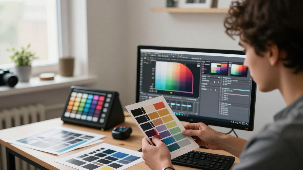
ICC profiles help translate color between your calibrated display and a specific lab, printer, ink, and paper combination. For predictable prints, use the lab’s exact paper profile to soft-proof, follow its export instructions, disable unwanted corrections, and inspect a test print under lighting similar to its final display.
Your portrait looked luminous on screen, yet the lab print arrived with muddy shadows, muted greens, and skin that felt a little too warm. The file did not mysteriously deteriorate on the way to the printer. Your screen and the paper simply spoke different color languages.
ICC profiles help a color-managed application translate color between those devices. Your monitor, editing software, printer, ink, and paper can all reproduce different ranges of color, so the profile describes what each part of the chain can show or print. According to the International Color Consortium, this characterization allows color-management systems to map colors more consistently across devices [1].
You will not make a reflective sheet of paper look identical to a glowing display. You can, however, get a close and repeatable match that preserves the mood, color balance, highlight texture, and shadow detail you worked to create. I will show you the same practical workflow I use when getting lab prints ready for clients, portfolios, and wall displays.
Calibrate with hardware and begin near 80–120 cd/m²; a screen that is too bright commonly produces files that print too dark.
Soft-proof with the ICC profile for the exact lab, printer process, ink, and paper rather than a profile for a similar surface.
Compare Relative Colorimetric and Perceptual rendering, then make small changes in a separate proof version instead of altering your master.
Follow the lab’s delivery instructions and embed the requested profile; do not convert to the lab profile unless the lab asks you to.
Approve important work from a physical test print viewed under lighting close to the print’s final location.
ICC Profiles: Getting Lab Prints That Match Your Edit
ICC profiles translate color between your calibrated display and a specific lab, printer, ink, and paper combination. The goal is not a physically identical image—it is a predictable print that preserves your edit’s mood, balance, texture, and detail.
Translate the intention, not the glow
A monitor emits light; paper reflects it. Paper’s white is the sheet itself, while its deepest black depends on ink, surface, and room lighting. Successful printing preserves visual relationships inside that smaller contrast range.
Screen
Bright highlights, luminous color, and deep blacks can appear together because the image is illuminated from behind.
- Wide color gamut
- High apparent contrast
- Brightness controlled by the display
The paper borrows light from its surroundings, reducing brightness, black depth, and reproducible saturation.
- Paper-dependent gamut
- Lower contrast ceiling
- Appearance changes with room light
Calibrate before you compensate
An overly bright display encourages edits that are too dark. Begin within the common print-editing luminance range, then refine against a trusted test print.
The paper is part of the profile
A printer profile characterizes one output condition. A profile for pearl paper cannot predict cotton rag accurately, even when both products come from the same lab.
Deeper blacks
Stronger saturation and visible reflections. Watch shadow blocking and bright specular highlights.
Softer contrast
A smaller gamut and tactile finish. Check dark separation, subtle color, and fine texture.
Characterful whites
Creamier highlights or reduced micro-detail. Inspect neutrals, white clothing, hair, and foliage.
| Profile decision | Predictive? | Practical result |
|---|---|---|
| Exact lab, process, ink, and paper profile | ✓ Yes | Best available on-screen preview of that printing condition |
| Profile for a similar paper surface | ~ Limited | Black point, color range, and paper tone may be misleading |
| No output profile available | ~ Physical proof | Send the requested embedded color space and order a test print |
Preview what paper will change
Soft proofing simulates the selected printer-and-paper condition on a calibrated monitor. The first preview may look dull because it is showing the paper’s lower brightness and contrast more honestly.
Inspect the vulnerable areas
Compare both; choose by appearance
Neither photographic rendering intent wins universally. Profile construction and image content affect the result.
One clean path from edit to wall
Make small print-specific changes in a separate proof version. Follow the lab’s delivery instructions exactly and keep every link in the color chain unambiguous.
Calibrate
Profile the display with hardware and disable adaptive brightness, HDR, and night modes.
Select
Load the exact ICC profile for the lab product and paper being ordered.
Soft-proof
Simulate paper and black ink, then compare rendering intents.
Export
Embed the requested profile and disable unwanted automatic correction.
Approve
Inspect a physical test print under lighting similar to its final location.
Avoid double color management
Only one stage should perform the final printer conversion. A soft-proofing profile predicts output; it is not automatically the profile the lab wants embedded in the delivered file.
Send a working-space file
The lab commonly requests sRGB or, less often, Adobe RGB and performs the output conversion itself.
- Embed the requested RGB profile
- Do not convert to the printer profile
- Disable automatic enhancement when available
Convert only when instructed
Some labs request a file converted to their printer-and-paper profile with all automatic corrections disabled.
- Use the exact supplied profile
- Choose the tested rendering intent
- Preserve a separate untouched master
Set the Right Goal Before You Judge a Print
ICC Profiles: Getting Lab Prints That Match Your Edit starts with one honest goal: make the print feel like the edit, not make two very different surfaces look physically identical. A monitor emits light while paper reflects it, so predictable color and tone matter more than a literal match.
A bright display can show sparkling highlights and deep blacks at the same time, almost like a window lit from behind. Paper has to borrow light from the room. Its whitest point is the paper itself, while its darkest black depends on the ink, surface, and available viewing light.
I see this difference most clearly with evening wedding photographs. On a wide-gamut monitor, blue-hour skies can glow above a nearly black suit. On matte paper, those same blues become quieter and the suit shadows close sooner, yet the print still works when the faces, atmosphere, and tonal relationships remain intact.
A successful print does not copy the monitor’s brightness. It carries the same visual intention into the smaller contrast range of ink on paper.
This mindset stops you from chasing impossible brightness. Instead, you watch the features that viewers actually notice: natural skin, clean neutrals, separated shadows, controlled highlights, and believable saturation. The ICC profile acts like a careful interpreter, but it cannot make the paper perform colors or blacks outside its physical limits.
As an affiliate, we earn on qualifying purchases.
Calibrate Your Screen So It Stops Lying to You
ICC Profiles: Getting Lab Prints That Match Your Edit depends more on a trustworthy monitor than on any clever export trick. Use a hardware colorimeter or spectrophotometer, turn off adaptive display features, and begin around 80–120 cd/m², gamma 2.2, with a white point suited to your lab and viewing light.
An overly bright screen is one of the most common reasons a print looks dark. Imagine editing beside a sunny window with the display blazing at maximum brightness: you naturally pull the file darker because everything appears open and radiant. The lab prints those darker pixel values, and the result can resemble a room after someone turned down the lights.
For many print workflows, D65 or D50 provides a useful white-point starting target. D65 often feels natural in a general editing space, while D50 aligns with traditional graphic-arts viewing conditions. Your choice depends on the lab recommendation and where the finished photograph will hang, so a print destined for a warm living room may need judgment under warmer light too.
- Disable True Tone, Night Shift, automatic brightness, and HDR modes during color-critical work.
- Keep the room stable, neutral, and fairly dim; colored walls and changing daylight make judgment drift.
- Recalibrate every few weeks to two months, depending on display stability and the accuracy your work requires.
- Keep a laptop at a consistent brightness and viewing angle, since small changes can alter the apparent shadows.
A lab profile cannot repair a display that shows blue as neutral or turns dark gray into black. According to PhotoMocha’s practical guidance, the monitor profile and printer profile perform different jobs: one describes the display, while the other describes the printing condition. You need both descriptions for a soft proof that matches your real output closely.
As an affiliate, we earn on qualifying purchases.
Choose the Exact Profile for Your Paper, Not Just Your Lab
ICC Profiles: Getting Lab Prints That Match Your Edit only works when you select the profile for the exact printing condition. That normally means the named lab process, ink set, printer settings, and specific paper or media, because glossy and matte surfaces do not share the same color or black-point limits.
A profile labeled for pearl paper cannot accurately predict a cotton rag print. Pearl paper often gives you a deeper black and punchier color, while matte fibers scatter light and soften both contrast and tiny detail. Using the wrong profile is like judging a song through the settings for a different pair of speakers: the translation begins from a false description.
Paper choice also shapes the emotional character of the photograph. A glossy surface can make a red race car look wet and polished, but that same sheen may fight the quiet mood of a foggy woodland scene. A warm fine-art paper can lend cream highlights to a portrait, while a bright white paper keeps snow and neutral studio backgrounds cleaner and cooler.
| Paper characteristic | Likely visual effect | Good proofing check |
|---|---|---|
| Glossy or lustre | Deeper apparent blacks, stronger saturation, visible reflections | Watch blocked shadows and bright specular highlights |
| Matte fine art | Softer contrast, smaller gamut, tactile surface | Check dark separation and fine texture |
| Warm paper | Creamier highlights and warmer neutral tones | Inspect white clothing, clouds, and gray backgrounds |
| Textured paper | Reduced visibility of very fine detail | View hair, foliage, fabric, and sharpening at print size |
Download the profile directly from the lab for the product you plan to order. If the lab offers no ICC profile, send the embedded color space it requests—often sRGB—and order a small proof. Without an output profile, accurate soft-proof prediction is not available, so the physical sample becomes your most useful reference.
color management software for photographers
As an affiliate, we earn on qualifying purchases.
As an affiliate, we earn on qualifying purchases.
Soft-Proof the Colors and Shadows That Paper Will Change
Soft proofing previews how a chosen printer-and-paper condition will map your photograph, letting you catch color shifts, clipped saturation, weak highlights, and lost shadow detail before ordering. In Photoshop or Lightroom Classic, select the lab’s profile and compare the proof against your master on a calibrated display.
Adobe’s soft-proofing documentation describes controls that simulate the output device, including paper color and black ink [2]. When you enable Simulate Paper Color and Simulate Black Ink, the image may suddenly look flat. That duller preview is useful: it represents the paper’s dimmer white and weaker black rather than promising the brilliance of the monitor.
Say you photographed a neon sign in heavy rain. The electric magenta may sit outside the matte paper’s gamut, while wet pavement shadows may print with little separation. A gamut warning identifies the risky colors, but it does not declare the whole image bad; inspect whether the mapped version still preserves the neon mood and reflected detail.
Compare the two rendering intents photographers use most often. Relative Colorimetric preserves in-gamut colors and moves colors outside the gamut to the nearest printable value. Perceptual can compress broader color relationships so a highly saturated scene fits inside the printer’s smaller palette.
- Try Relative Colorimetric first for products, neutral interiors, controlled portraits, and images whose in-gamut colors already look right.
- Try Perceptual for vivid flowers, stage lighting, sunsets, or photographs with large areas beyond the paper gamut.
- Use black-point compensation with Relative Colorimetric when the lab or application recommends it, since it can preserve useful shadow separation.
Neither intent wins every time because the result also depends on how the profile was built. Create a virtual copy or proof version, then make small output-specific changes rather than altering your master. I often lift one narrow shadow range or trim a single oversaturated red; a local, measured adjustment usually beats washing the whole photograph with a global brightness boost.
As an affiliate, we earn on qualifying purchases.
Export One Clean File Without Double Color Management
A reliable export follows the lab’s instructions exactly and lets only one stage perform the final printer conversion. Send an embedded sRGB or Adobe RGB file when the lab manages conversion, or convert to its output profile only when the lab explicitly requests that workflow. Doing both can produce unexpected color shifts.
Many photographers mistake a downloadable soft-proof profile for a delivery profile. One lab may provide a paper profile so you can preview the result, yet still request an sRGB JPEG because its production software handles the final conversion. Converting beforehand in that case can send the color through the mapping process twice, like translating a sentence through two extra languages.
- Edit the master in a color-managed application, preferably at a bit depth that resists banding during heavy adjustments.
- Confirm the lab’s required color space, file format, dimensions, and correction settings.
- Install the exact profile for the selected lab and paper, then create a separate proof version.
- Soft-proof and compare Relative Colorimetric and Perceptual.
- Make restrained proof-specific adjustments to color, tone, or output sharpening.
- Export using the lab’s requested space and embed that profile.
- Select no correction or print as submitted when you have prepared the file yourself.
- Order a physical proof before committing to a large or client-facing print.
Assign Profile and Convert to Profile are not interchangeable. Assigning changes how the existing RGB numbers are interpreted and can make skin or skies jump to strange colors. Converting recalculates the numbers to preserve the visible appearance as closely as the destination space allows, which is usually the correct operation during output preparation.
JPEG at high quality works well for many photographic labs, while some accept TIFF when you need greater tonal precision. More bits do not create a larger gamut, and changing pixels per inch does not fix color. Resolution, sharpening, bit depth, and color management are related parts of production, but each solves a different problem.
Use a Test Print to Catch What Your Monitor Cannot Show
A physical test print is the final authority because no monitor can reproduce paper texture, surface reflections, ink depth, or real display lighting perfectly. For exhibitions, client albums, portfolios, or large wall pieces, order a small proof and inspect it under light similar to the print’s destination before approving the full job.
I once prepared a low-key portrait that looked balanced under neutral studio light but became heavy and closed when viewed in a dim hallway. The file was not broken, and the lab had not failed. The print simply received too little light, so the dark jacket and background merged like charcoal marks in a shadowed room.
Your proof should include the parts most likely to reveal trouble: deep shadows, neutral grays, skin, smooth skies, bright clouds, saturated fabric, and fine hair or foliage. If you print frequently, keep a known reference image with those features. It helps you separate a weak file from a changed monitor, unsuitable viewing light, or inconsistent lab output.
- Check neutral grays for green, magenta, blue, or warm casts.
- Look for steps within deep shadows, not merely a black mass.
- Inspect skin tones before judging decorative colors.
- View smooth gradients for banding and bright areas for lost texture.
- Stand at the intended viewing distance to judge detail and output sharpening.
Lighting can change the color relationships through illuminant metamerism. A near-neutral print may look balanced under daylight and slightly green under a household LED with an uneven spectrum. D50 remains a standard graphic-arts reference, but the most useful final check happens under the warm track lights, cool office panels, or window light where the photograph will actually live.
Keep Wide-Gamut and HDR Screens From Overpromising
Wide-gamut and HDR displays can show brighter highlights, deeper apparent contrast, and colors beyond many print gamuts, so they make print simulation more necessary rather than less. Prepare a separate SDR, print-oriented version when your screen edit depends on luminous highlights or intense colors that paper cannot physically reproduce.
A modern Display P3 or Adobe RGB-class monitor may reveal emerald fabric and saturated cyan water that an ordinary sRGB screen hides. That extra reach helps you edit more accurately, but only when your application handles profiles correctly. An untagged file or unmanaged browser preview can display those colors with the subtlety of a paint bucket spilled across the screen.
HDR creates an even larger gap. A sunlit metal edge may sparkle on the monitor while a print must represent that brightness through local contrast, careful tone placement, and the paper’s white. For a concert photograph with blazing spotlights, I would preserve a dramatic HDR master but build a separate print proof that keeps highlight shape and shadow rhythm within the paper’s narrower range.
Repeated conversions between color spaces can introduce rounding, clipping, or lost gamut, so keep one high-quality master file and branch output copies from it. Use a broad editing space when your workflow benefits from it, then deliver exactly what the lab requests. A wider space is not automatically better if the lab expects sRGB or ignores an embedded profile.
Phone screens and browser previews remain poor judges for critical matching because brightness, color management, and viewing conditions vary. Use them to check composition or general appeal, not final neutrality. The dependable chain remains simple: profiled display, managed application, paper-specific proof, correct export, and physical verification.
Frequently Asked Questions
Why are my lab prints darker than my screen?
Your display is probably too bright compared with the light falling on the print. Calibrate it near 80–120 cd/m² as a starting range, keep the room stable, and inspect the print under bright, reasonably neutral light before changing the file.
If a properly viewed test still looks dark, make a print-specific adjustment rather than applying the same brightness boost to every image. A snowy landscape and a candlelit portrait rarely need identical correction.
Should I convert my file to the lab’s ICC profile?
Convert only when the lab explicitly tells you to. Many labs provide an ICC profile for soft proofing only while requesting an embedded sRGB or Adobe RGB delivery file for their own conversion.
If you convert and the lab converts again, the file can suffer double color management. Confirm the instructions for the exact product rather than guessing from the presence of a download link.
Why does Simulate Paper Color make my image look flat?
The preview becomes flatter because paper has a dimmer white and weaker black than a glowing monitor. Simulate Paper Color and Simulate Black Ink show that reduced contrast more honestly, even though the first view can feel disappointing.
Give your eyes a moment to adapt, then inspect important tonal relationships. You may need a small proof-specific curve adjustment, but resist turning every shadow gray just to restore the screen’s punch.
Is Perceptual rendering always best for photographs?
No. Perceptual can preserve relationships in a highly saturated sunset or neon scene, while Relative Colorimetric may keep in-gamut products, neutrals, and skin closer to the edited values.
Profile construction also affects the result. Compare both intents in the soft proof and choose the version that preserves the photograph’s color relationships and tonal character.
Should I edit in sRGB, Adobe RGB, or ProPhoto RGB?
A wide space such as ProPhoto RGB can preserve color during high-bit-depth master editing, while Adobe RGB retains some printable colors beyond sRGB. For delivery, use exactly the space requested by the lab, which is often sRGB.
A large color space does not force the printer to reproduce colors outside its gamut. Keep your master, then create a separate output copy for the requested workflow.
What should I do if the lab provides no ICC profile?
Use the color space and file settings the lab requests, embed that profile, and disable automatic corrections if you prepared the image yourself. Without an output profile, accurate soft proofing is unavailable, so order a small physical test.
Choose a test image with skin, neutrals, deep shadows, bright highlights, and saturated color. That single sheet gives you a practical picture of the lab’s tone, color, and paper behavior.
Conclusion
Your best route to a print that feels like your edit is to control the chain, not brighten the file blindly after one disappointing order. Start with a calibrated monitor, proof through the exact paper profile, export as the lab requests, and turn off corrections that would rewrite your choices.
Then make one small test print and carry it to the place where the finished photograph will hang. Let your eyes move from clean highlights to open shadows and believable color. When those parts hold together under the real light, you have more than a screen match—you have a photograph that survives the journey from glowing pixels to ink, paper, and wall.
Fall Picks
fall essentials
As an affiliate, we earn on qualifying purchases.