
TL;DR

Get audio and creator gear delivered free with Prime
- Fast, free delivery on millions of items
- Prime Video, Amazon Music and more included
- Member-only deals all year
A test print is a small, controlled proof produced before committing to a full document, photo series, or batch of copies. Check the riskiest page first, then approve one complete copy using the final printer, paper, scale, color settings, and finishing method.
One sheet of paper can prevent fifty bad prints, yet many people still treat a test print as waste. I see the opposite: it is a small, controlled pause that catches the dark portrait, cropped border, tiny caption, or upside-down back page before the error multiplies. That pause saves paper, ink, and patience.
Your screen makes a print job feel more certain than it is. The image glows, the type looks crisp at 150% magnification, and the border appears perfectly even. Then the printer feeds a sheet with a dry mechanical chatter, and the result arrives darker than expected, shifted by a few millimetres, or trimmed at the edge because Fit to Page quietly changed the scale.
This guide gives you a practical proofing habit for photographs, portfolios, invitations, booklets, labels, forms, and wall art. You will learn which page to print first, what to inspect, when cheap paper is useful, and when only the final stock will tell the truth. According to PhotoMocha [1], the low-waste sequence is simple: check digitally, print the smallest useful proof, correct the file, and approve one complete copy before starting the full run.
Print the page most likely to fail first: choose small text, dark photographs, edge-positioned artwork, precise dimensions, or demanding colors.
Use draft or grayscale paper for layout checks, but judge color, sharpness, opacity, drying, and folding on the final paper.
Check scale in both the application and printer dialog; Actual Size or 100% matters for labels, templates, packaging, and measured artwork.
Approve one complete copy with the final production settings, then write the file version, paper, printer, scale, color mode, and duplex edge on it.
For personalised printing, test the longest names, addresses, and codes rather than an average record.
Test Prints: The Habit That Saves Paper and Sanity
A test print is a small, controlled pause before production. Check the riskiest page first, correct the file, then approve one complete copy using the final printer, paper, scale, color settings, and finishing method.
Representative sheet can reveal a problem before it becomes a full failed run.
Use Actual Size when labels, templates, packaging, or measured artwork must remain exact.
Pages are often enough to test duplex direction, page order, folds, and binding space.
Print the page most likely to tell you the truth.
Your screen emits light; paper reflects it. A bright preview can conceal muddy shadows, weak fine type, scaling changes, clipped borders, and finishing problems that only become obvious when ink meets the final sheet.
Dark photographs
Inspect shadow detail, skin tones, neutral grays, saturation, banding, and whether dense blacks merge into empty shapes.
Small or light text
Check captions, thin strokes, line spacing, missing symbols, font substitution, and real-world reading comfort.
Edges and dimensions
Confirm borders, crop marks, safe areas, labels, templates, mailing windows, and artwork close to printable limits.
Duplex and page order
Turn the pages physically. Verify the flip edge, front-to-back alignment, blank pages, collation, and booklet imposition.
Final paper stock
Texture, coating, color, thickness, and absorbency change sharpness, contrast, opacity, drying, and folding.
Codes, forms, and folds
Scan QR codes and barcodes, write on form fields, test checkboxes, mark cuts, and fold the sheet as intended.
Use the fewest useful sheets.
Move from inexpensive checks to increasingly realistic proofs. Each stage should answer one new question; stop and correct failures before advancing.
Check digitally
Spellcheck, preview, export a PDF, verify fonts, dimensions, blank pages, and image placement.
Print the risk
Select the page with the smallest type, darkest image, tightest edge, or most exact measurement.
Proof structure
Use draft or grayscale mode to test margins, scale, text flow, and page rhythm economically.
Test a section
Print two to four pages when duplexing, folding, image crossovers, binding, or order matters.
Approve one copy
Use the final printer, paper, orientation, scale, driver settings, color handling, and finishing.
Write the file version, paper, printer, scale, color mode, orientation, and duplex edge on the accepted copy. Keep it beside the printer and do not change production settings after approval.
Use the cheapest sample that can answer the question.
Ordinary copier paper is excellent for structure. It cannot reliably approve color, shadow detail, final sharpness, drying, opacity, or folding behavior on another stock.
| Proof method | Layout and order | Scale and clipping | Color and detail | Folding and finish | Best moment to use it |
|---|---|---|---|---|---|
| Digital Preview or PDF |
✓Strong | ~Partial | ~Screen only | —No | Before using any paper |
| Economy Draft or grayscale |
✓Strong | ✓Strong | —No | ~Basic | Early structural correction |
| Representative Risk page |
~Focused | ✓Strong | ✓If final stock | ~Limited | To expose the likely failure |
| Section Two to four pages |
✓Strong | ✓Strong | ~Selective | ✓Strong | For duplex, folds, and binding |
| Production One complete copy |
✓Approve | ✓Approve | ✓Approve | ✓Approve | Immediately before the full run |
Ten checks before “Print All.”
Review the proof at normal reading distance and under lighting similar to its destination. Handle it as the audience will: turn, fold, scan, write, trim, and view it upright when appropriate.
Page format
Confirm intended size and orientation.
Scale
Disable unintended Fit to Page or shrinking.
Margins
Inspect headers, footers, borders, and crop areas.
Typography
Check size, spacing, symbols, and thin strokes.
Images
Look for softness, banding, mud, and artifacts.
Color
Judge grays, skin tones, brand colors, and contrast.
Duplex
Verify the flip edge and front-to-back alignment.
Page order
Check odd, even, blank, and imposed pages.
Finishing
Mark folds, cuts, holes, bleeds, and binding space.
Function
Scan codes and test fields, windows, and checkboxes.
Turn uncertainty into a controlled decision.
A good proofing habit preserves the logic of the job from file review to production approval.
Question
Define the exact risk the proof must test.
Proof
Choose the smallest realistic sample.
Inspect
View, handle, scan, fold, and measure.
Correct
Fix the source file before printing again.
Approve
Record final settings and lock production.
For personalized printing
Test the longest names, addresses, codes, and unusual characters rather than an average record. Extremes expose overflow and substitution problems.
The habit in one sentence
Check digitally, print the smallest useful proof, correct the file, and approve one complete production copy before multiplying it.
Why One Small Proof Can Rescue an Entire Print Run
Test prints save paper and sanity because they turn one uncertain print run into a small, controlled decision. A test print is a controlled proof produced before committing to a full document, photo series, or batch of copies, so a clipped edge or muddy shadow costs one sheet instead of fifty.
The value comes from multiplication. A footer sitting 3 millimetres too low seems harmless in a PDF, but it becomes fifty clipped footers in a fifty-copy handout. A portrait that prints slightly too dark becomes a whole box of faces with blocked-up hair and empty black jackets. Small errors scale; careful proofs stop them while they are still small.
Imagine printing twenty exhibition captions on heavy textured stock. The type looks polished onscreen, but the paper drinks in the black ink and makes the 8-point text look soft and frail. One early sample lets you raise the type size, add a little weight, and protect the remaining nineteen sheets.
A useful proof answers one clear question. It is not random extra printing; it is a cheap physical check made before a mistake becomes a pile.
I treat each proof like a frame from a contact sheet. It does not need to show everything at once. It needs to reveal the most likely failure: scale, color, legibility, alignment, or finishing. This habit saves paper and gives you something just as valuable—a calm moment to make a decision with the print in your hands.
As an affiliate, we earn on qualifying purchases.
What Your Glowing Screen Cannot Tell You About Paper
Test prints reveal physical problems because a screen emits light while paper reflects the light falling on it. That difference can make a photograph look darker, flatter, and less saturated in print, even when the file is correct. Paper also adds its own color, texture, coating, and absorbency to the final image.
A bright display behaves like a small illuminated window. A print behaves more like a painted wall: it can only return the light it receives. If you edit a shadowy woodland photograph on a display set too bright, the moss may glow emerald onscreen while the print turns into a dense green-brown patch under ordinary room light.
Paper changes the character again. Glossy photo paper can hold deep blacks and crisp detail, while an uncoated sheet scatters light and gives the same image a quieter, softer surface. That softer result may suit a misty landscape beautifully, but it may weaken the tiny eyelashes and dark suit fabric in a formal portrait.
Color adds another limit. Bright blues, greens, and oranges displayed in RGB can sit outside the range a printer, ink, and paper combination can reproduce. According to PhotoMocha’s color-management guidance [2], ICC profiles improve predictability, but even a calibrated display and a correct profile cannot replace a physical proof under realistic light.
Judge the sample where the finished work will live. A warm lamp can make neutral paper look creamy, while cool daylight can expose a green cast in gray shadows. For framed wall art, I hold the print upright rather than flat on a desk; the angle, reflections, and viewing distance can change whether fine detail feels alive or merely busy.
As an affiliate, we earn on qualifying purchases.
A Five-Step Routine That Uses the Fewest Useful Sheets
Test prints work best when you move from cheap digital checks to increasingly realistic physical proofs. Each stage should answer a new question, starting with file integrity and layout and ending with final paper, final settings, and final finishing. Stop and correct problems between stages instead of carrying them forward.
- Check the file digitally. Run spellcheck, inspect print preview, export a PDF, confirm embedded fonts, and check page dimensions. Zoom in on photographs, then zoom out to scan page rhythm, blank pages, and section breaks.
- Print the riskiest page. Choose the page with small type, dark photographs, edge-positioned elements, fine lines, or a precise measurement. For a wedding album, that might be a dark reception spread rather than the bright cover portrait.
- Use an inexpensive structural proof. Draft or grayscale mode can reveal margins, page order, scale, and text flow without using much ink. Mark the sheet with a pencil so you remember what that proof was meant to test.
- Print a short section. Use two to four pages when you need to check duplex flipping, booklet order, image crossover, or binding space. Fold, turn, and handle the pages exactly as a reader will.
- Approve one complete production copy. Use the exact printer, paper, orientation, driver settings, color handling, scale, and finishing planned for the run. Compare it with the file, scan functional elements, and keep this approved copy beside the printer.
For a twelve-page portfolio, I might start with one page containing a dark image and pale caption text. After fixing those, I print a four-page duplex section to check page turns, then one complete copy on the final stock. That staged routine uses a few deliberate sheets, while printing all twelve pages after every correction would leave a growing stack of obsolete versions.
Keep the purpose of each stage narrow. Draft mode is excellent for finding a wandering footer, but it cannot approve skin tone or shadow detail. A final-quality proof can answer those questions, but only if you resist changing the driver settings once the proof has passed.
As an affiliate, we earn on qualifying purchases.
Choose the Cheapest Proof That Can Answer Your Question
The right proof is the least expensive sample that reproduces the feature you need to judge. Use draft paper for structure, final paper for appearance, and a complete copy for sequence and handling. A cheaper test saves resources only when it can give you a trustworthy answer.
| Proof type | Best for checking | What it cannot approve |
|---|---|---|
| Digital preview or PDF | Page count, obvious clipping, fonts, orientation, and file version | Paper handling, physical readability, exact color, and duplex alignment |
| Draft or grayscale sheet | Margins, scale, pagination, text flow, and rough image placement | Final color, rich blacks, fine detail, and ink coverage |
| Small sample on final paper | Color, texture, sharpness, drying, opacity, and fine lines | Full page order, binding behavior, and collation |
| Short duplex section | Front-to-back alignment, flipping edge, show-through, and page turns | The full document’s sequence and finishing |
| Complete production proof | The entire job under final settings and finishing conditions | Nothing material if production remains unchanged |
Suppose you are preparing forty folded invitations on thick cotton stock. Copier paper can tell you whether the date is misspelled and whether the panel order works, but it cannot show whether the fold cracks the ink or whether the dark blue takes too long to dry. For those questions, a single sheet of final stock carries more useful information than ten cheap sheets.
The same distinction matters for photographs. You can place several small color samples on one sheet to compare two shadow adjustments or three paper profiles. Once you choose the best treatment, print the full image at its intended size; enlargement can reveal softness and sharpening halos that a postcard-sized sample hides.
This works well, except when the printing process itself changes. A home inkjet can confirm hierarchy, approximate size, folds, and wording for a commercial job, but it cannot predict a press’s exact color, screening, trimming, or coating. When those details carry real consequences, request a production or contract proof from the printer.
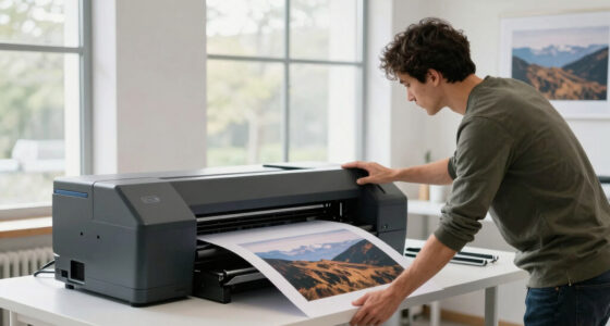
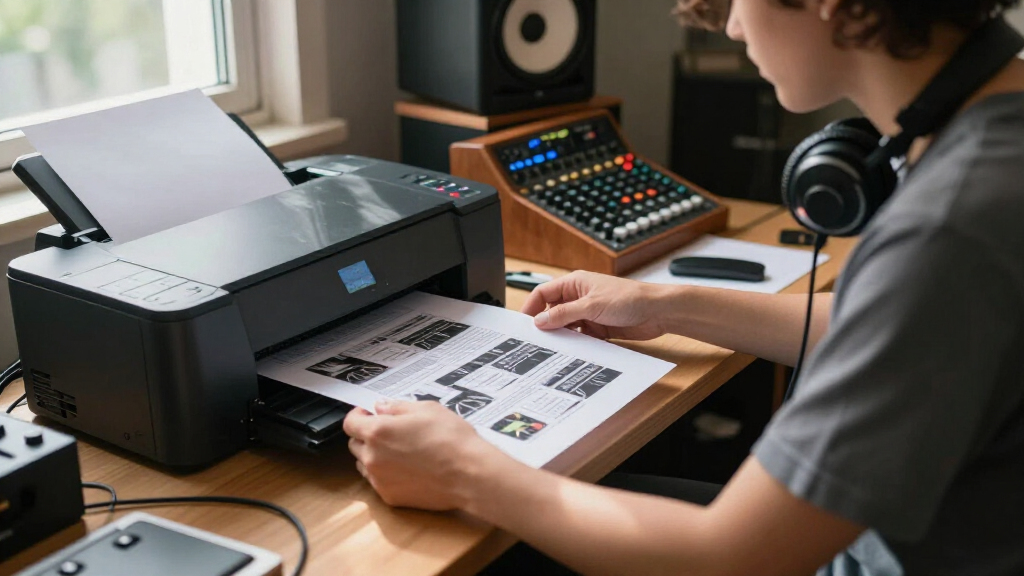
printer test sheet for layout check
As an affiliate, we earn on qualifying purchases.
As an affiliate, we earn on qualifying purchases.
The Ten Checks That Catch Expensive Mistakes Early
A reliable inspection covers dimensions, readable content, image quality, color, page mechanics, and anything the reader must use. Check the proof in a fixed order so an attractive photograph does not distract you from a clipped page number or a QR code that will not scan.
- Page size and orientation: Confirm A4, Letter, A3, or the intended custom size in both the document and printer dialog.
- Scale: Use 100% or Actual Size when labels, templates, rulers, mats, or packaging must match physical measurements.
- Margins and edges: Inspect headers, footers, borders, crop marks, bleed, and artwork sitting near the printable boundary.
- Typography: Check point size, line spacing, missing symbols, substituted fonts, and thin text over colored backgrounds.
- Images: Look for pixelation, banding, oversharpened edges, muddy shadows, weak contrast, and broken transparency.
- Color: Examine neutral grays, skin tones, brand colors, and separation between text and its background.
- Duplex behavior: Confirm the flipping edge and compare front-to-back alignment against a window or light.
- Page order: Read odd and even pages, section starts, intentional blanks, booklet imposition, and collation.
- Finishing: Mark folds, cuts, binding holes, trim lines, safe areas, and image crossovers.
- Functional elements: Scan QR codes and barcodes, write on form fields, tick checkboxes, and test mailing-window placement.
A gallery label offers a good example. At 200% zoom, a thin gray caption may look elegant and restrained. Printed at actual size under gallery lighting, it can become a faint silver whisper that visitors lean toward and still cannot read. The proof turns an abstract design choice into a physical fact.
Resolution also needs physical scale. Around 300 pixels per inch is common for close-viewed photographic prints, but the useful number depends on the image, printer, process, and viewing distance [2]. A large wall print viewed from several metres can tolerate less detail than a small portfolio print held close enough to see the paper fibres.
Do not inspect only with your eyes. Fold the brochure, turn the booklet, place the label on its container, and put the framed print against the wall. Use reveals problems that a flat sheet on a clean desk politely hides.
Lock the Approved Settings Before the Printer Starts Running
An approved proof remains trustworthy only when the production run uses the same file version, printer, paper, scale, driver settings, color handling, and finishing method. Record those choices on the proof itself, because one silent setting change can break the link between the sample you approved and the batch you receive.
Printer drivers often override document choices. Your layout application may say A4 at 100%, while the print dialog quietly applies Fit to Page or selects a different media preset. Check size, scaling, paper type, quality, color management, orientation, and duplex options in both places before releasing the run.
Version mistakes are just as common. You correct a typo, export a new PDF, then reopen yesterday’s file from the recent-files menu. A simple filename such as portfolio_v07_APPROVED.pdf, paired with the approval date on the physical proof, gives you a clear trail when several nearly identical files sit in one folder.
Write the date, filename, printer, paper, color mode, quality, scale, duplex edge, and finishing notes on the approved copy. For a team job, add the approver’s initials. Keep that sheet near the printer so anyone loading paper or restarting a stalled queue can match the production settings without guessing.
Variable-data jobs need one more check: test the worst case, not the tidy average. A short name may fit perfectly on a badge while a long double surname crashes into the logo. Print records with the longest names, longest addresses, unusual symbols, and longest codes before committing to a full document or batch of personalised pieces.
After approval, resist casual improvements. Changing from economy mode to high quality can alter ink coverage and drying; switching paper lots can shift surface color; turning on borderless mode can enlarge and crop the image. Approve what you will produce, then produce exactly what you approved.
Frequently Asked Questions
Is a test print wasteful?
A purposeful one-sheet proof can prevent an entire batch from going into recycling. The waste comes from printing without a clear question, so choose the riskiest page and decide whether you are checking layout, color, scale, or finishing before pressing Print.
Is print preview enough for a simple document?
Print preview can catch page order, orientation, and obvious clipping, but it cannot show paper feeding, actual type size, duplex alignment, ink spread, or real printed color. Even a simple form deserves one physical proof when people must write in small fields or scan a code.
Which page should I test first?
Choose the page with the highest chance or cost of failure: dark photographs, small text, borders near the edge, precise dimensions, or key brand colors. In a photo booklet, a shadow-heavy reception image usually reveals more than a bright title page with large black type.
Do I need to use the final paper?
Use inexpensive paper for spelling, pagination, margins, and rough scale. Use the final paper when judging color, black density, sharpness, show-through, drying, folding, texture, or overall appearance, because the substrate changes the result.
Why does my photograph print darker than it looks onscreen?
Your display emits light, while the print depends on reflected room light. Lower an overly bright display, use the correct printer-and-paper profile, and inspect the proof under realistic lighting; then adjust the file from what the physical print actually shows.
What does Actual Size mean in the print dialog?
Actual Size normally means 100% scale, with no automatic shrinking or enlargement. Use it for labels, templates, rulers, packaging, sewing patterns, and other measured designs, then verify one known dimension with a physical ruler before producing the full batch.
How many test prints should I make?
A simple document may need one representative sheet and one approved complete copy. Complex photographs, booklets, folded pieces, expensive stock, or personalised jobs may need separate structural, color, duplex, and production proofs, with each sheet answering a different practical question.
Conclusion
The habit to remember is simple: preview digitally, print the smallest useful proof, inspect it physically, correct the file, and approve one complete copy. A test print should answer a specific question, whether that question concerns scale, color, page order, readability, folding, or the quiet menace of an upside-down back page.
Before your next long print run, pause after the first sheet slides into the output tray. Hold it under the light, run a finger over the paper, read the smallest line, scan the code, and check the edges. That single deliberate sheet can stand between you and a warm, expensive stack of the same mistake repeated fifty times.
Halloween Picks
halloween
As an affiliate, we earn on qualifying purchases.