
TL;DR

Get audio and creator gear delivered free with Prime
- Fast, free delivery on millions of items
- Prime Video, Amazon Music and more included
- Member-only deals all year
Photo calendars and cards turn photographs you already own into useful gifts tied to shared memories. Choose a small, coherent set of high-quality images, check dates and crops in the print preview, and leave enough time for production and delivery.
The photo that gets the biggest laugh at a family gathering may be the one with a dog’s muddy nose pressed against the lens. That small, imperfect moment can make a better gift than a dozen polished portraits, because it belongs to the people who will receive it.
Photo calendars and cards give your archive a second life: a calendar can bring a familiar face into the kitchen each month, while a card can hold one memory and a few handwritten lines. As a photographer, I find that the best results start with the story you want to share, then move through image quality, layout, printing, and delivery.
This guide will help you choose a theme, spot the details that often go wrong, and make a print that feels personal without crowding it with decoration. You’ll also see how a phone photo can work, when a larger screen helps, and what to check before you place an order.
Choose a single shared theme so the calendar or card tells a story rather than displaying unrelated images.
Check the calendar year, start month, week-start day, holidays, and personal dates in the final preview.
Use the highest-quality original available, follow image warnings, and inspect faces and important details near crops and binding edges.
Pick a card format based on how much space the message needs, and keep text readable against the photograph.
Review image permissions, privacy details, order information, and the provider’s current delivery estimate before submitting.
A thoughtful print guide · Keepsakes from your photo archive
Photo Calendars and Cards: Gifts From Your Archive
Turn familiar photographs into gifts people can use and keep. Choose one shared story, give each image room to breathe, and check the details that matter before you order.
01 / Start with the story
Choose images that belong together
Familiar photographs often matter more than elaborate design. A small, intentional set gives each memory space and helps the finished gift feel personal.
Follow one thread
Try weekend walks, a child’s changing expressions, or the family cat’s favorite sleeping spots. Let the theme guide your selection.
Mix distance and mood
A close portrait, a wide landscape, and a quiet everyday scene can sit naturally together when they share a story.
Let one image speak
A candid of siblings leaning together may hold more meaning than a collage. Add a caption only when it gives helpful context.
02 / Make it useful
Plan the calendar around its recipient
Decide whether the calendar is mainly for appointments or for enjoying a new photograph each month. The layout should support that routine.
Make the dates part of the gift
For a couple’s first year in a new home, pair monthly photographs with a few family birthdays and the move-in date. A short caption like “First tomatoes, July” adds a memory without crowding the grid.
Preview the calendar details
- ✓Confirm the intended calendar year and start month.
- ✓Check whether the week begins on Sunday or Monday.
- ✓Review holidays, birthdays, anniversaries, and other personal dates.
- ✓Leave date boxes large enough for appointments if the recipient writes them in.
- ✓Keep captions and extra entries from making the grid hard to read.
03 / Match format to message
Choose a card with room for its purpose
Give the photograph, note, or event details enough space. Compare envelopes, address areas, and available layouts before settling on a format.
| Format | Best suited to | What to check | Message space |
|---|---|---|---|
| Flat photo card | A clean, image-first greeting | Contrast, crop, and mailing layout | Short note |
| Folded greeting | A personal update or longer message | Inside print area and envelope options | Room to write |
| Postcard | A brief, informal hello | Address space and readable back layout | Compact |
| Invitation | An event guests need to attend | Date, time, and location against the image | Details first |
04 / Print with confidence
Check sharpness, crops, and color
Use the highest-quality original available, then inspect every photo in the design preview at its intended printed size.
Trust the warning
A photo that looks crisp on a bright phone can soften when enlarged on paper. Follow the printer’s quality alert or choose a smaller image area.
Protect the important edges
Keep faces, fingertips, pet ears, and meaningful scenery away from trim lines and spiral binding. Review the crop at final size.
Expect color to shift
Backlit screens and printed paper can show different brightness and color. Check the provider’s preview and avoid text that disappears into a bright sky.
05 / From archive to doorstep
Keep the process simple
Organize first, design second. A little preparation makes mobile uploads easier and leaves more time for cropping and proofreading.
Make an album
Collect candidate images around one memory or theme.
Narrow the set
Choose clear, well-lit originals with a natural rhythm.
Give photos room
Pick a useful layout and keep decoration restrained.
Proof every page
Check dates, text, faces, crops, and quality alerts.
Leave time
Check current production and delivery estimates.
Use images you have permission to print and share. Consider sensitive details before uploading or posting.
Features, prices, paper, templates, and privacy terms vary. Review the current options before ordering.
Production and shipping vary by provider, destination, and season. Peak periods may take longer.
Quick answers
Before you place the order
Most services support phone-photo uploads. A larger screen can make detailed cropping and proofreading easier.
How many photos do I need?
It depends on the layout. Some calendars use one main photo per month; others support collages or extra images.
What resolution should I use?
Follow the printer’s guidance for your chosen size. Use the best original available and heed low-resolution warnings.
Can I design from my phone?
Usually. Many services support mobile uploads; a larger screen may make crop checks and proofreading easier.
Can I add dates or captions?
Often, but features vary by provider and product. Check the editor before choosing a template.
Let one shared story guide your photo choices
A photo calendar or card feels personal when the pictures point to a memory the recipient shares with you. Start with a simple theme, such as a year of weekend walks, a child’s changing expressions, or the family cat’s preferred sleeping spots. That gives the finished gift a thread the viewer can follow.
When I edit a set for print, I look for variety in distance and mood. A close portrait, a wide landscape, and a quiet everyday scene can sit together naturally if they belong to the same story. Imagine a calendar for a grandparent: January might show a snowy visit, April a garden full of tulips, and September a school backpack on the porch. The images don’t need matching colors; they need a reason to be together.
For a card, one strong photograph often does more than a collage. A candid of two siblings leaning together may carry more meaning than a grid of ten posed shots. Add a short caption only if it adds context the image cannot supply, such as the date of a reunion or the name of a place.
Familiar images often matter more than elaborate design. A small set of carefully chosen photographs can make a stronger calendar than filling every available box with unrelated snapshots. That restraint also gives each page room to breathe.
Products Worth Considering

Jackery Explorer 2000 v2 Portable Power Station with Two 200W Solar Panels
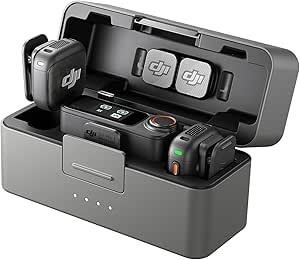
DJI Mic 3 Wireless Microphone System (2 Transmitters, 1 Receiver, Charging Case)

Samsung 27 Odyssey OLED G5 (G50SF) QHD Gaming Monitor
As an affiliate, we earn on qualifying purchases.
Build your calendar around a clear, useful plan
A photo calendar works best when its pictures and dates are both easy to use. Before opening a design editor, decide which year it should show, which month it should start with, and whether the week begins on Sunday or Monday. These choices shape how the recipient reads the calendar every day, so a familiar convention can matter as much as the photographs.
Think about the recipient’s routine. A household that writes appointments on the calendar may need generous date boxes, even if that means choosing a smaller photo area. Someone who mainly enjoys a monthly photograph may prefer a larger image and a compact grid. Neither layout is universally better: the useful choice depends on whether the calendar is primarily a planning tool or a way to revisit memories. Check whether the service allows birthdays, anniversaries, holidays, or captions; features vary by provider and format.
For example, you could make a calendar for a couple who recently moved. Use one image each month from their first year in the new home, then mark their move-in date and a few family birthdays. A short caption like “First tomatoes, July” gives the page a memory without turning it into a scrapbook. Personal dates make the calendar feel made for them, but too many entries can crowd the grid and make everyday appointments harder to see.
Plan the dates before the design, then confirm the year, start month, week-start day, and personal entries in the preview. Calendar templates differ, so don’t assume a default matches how the recipient organizes their week. A minute spent checking the grid can save twelve months of small annoyances and prevent a gift from becoming difficult to use.
Choose the right photo format for the occasion
The right card format depends on whether the photograph or the written message should take center stage. A flat photo card gives the image a broad, clean surface; a folded greeting card leaves room inside for a personal note; and a postcard keeps the gesture short and informal. Invitations serve a different purpose, since guests need clear event details as well as a photograph.
Consider a holiday portrait. If you want to include a warm message and a family update, a folded card gives you room to write. If the photograph says everything by itself, a flat card may feel more direct. For a child’s birthday invitation, choose a design where the date, time, and location remain readable against the image. The more information the recipient needs to act on, the more space and contrast that text needs.
Cards turn personal images into practical greetings when the format fits the message. A landscape photo may suit a wide flat card, while a close portrait can work well on a vertical design. Check whether envelopes are included and whether the layout leaves space for addresses or a handwritten note. A striking image can lose its effect if essential details are squeezed into a corner or hidden by the mailing format.
Keep the design simple enough that the recipient notices the photograph first. In a print shop preview, look for text that competes with faces, decorative borders that crowd the edges, or pale lettering that may disappear against a bright sky. If you’re unsure, remove one design element and compare the two previews. The simpler version often gives the image more presence, while a small amount of well-placed text can make an invitation or greeting clearer.
Check sharpness, crops, and color before you print
Use the highest-quality original available and inspect the print preview at the intended size. A picture can look crisp on a small, bright phone screen yet soften when enlarged on paper. The larger the printed area, the more visible limited detail becomes, especially in faces and fine textures. If the design service flags low resolution, take that warning seriously and choose another image or a smaller print area.
Look closely at faces and edges. A crop can cut off a child’s fingertips, a pet’s ears, or the mountain peak that explains where the photograph was taken. Keep important details away from the page edges and the calendar binding, where the trim or spiral may hide part of the image. A tighter crop can make a subject feel more prominent, but it can also remove the setting that gives the memory meaning; check the composition at final size before deciding.
For example, a phone portrait of a dog by a window might be perfect for a card if you leave space around the ears and muzzle. Zooming into the editor may reveal that the original was a screenshot or a cropped social-media copy; going back to the camera roll can restore the detail the larger print needs. The original file preserves more image information, which gives the printer more to work with.
Printed color and brightness can differ from a backlit display. A screen may make a dim indoor photograph look brighter than it will on paper. If a face already looks shadowed, choose a better-lit frame or make a modest edit before upload. Strong edits can brighten shadows, but they may also make skin tones or colors look unnatural, so compare the result with the original. Review the service’s preview and quality warning instead of assuming the screen image predicts the final print exactly.
Make the design easy to read and pleasant to live with
A successful layout gives the photograph space and keeps useful details easy to find. Compare the available size, paper, binding, template, and envelope choices before you settle on a design. These choices affect both how the gift feels and how it works: a large image can make a stronger display piece, while a sturdier binding or generous date grid may matter more for a calendar used every day. A simple template often works well because it lets a face, landscape, or small everyday moment hold attention without a busy frame around it.
Try this quick sequence before you commit:
- Pick a theme and gather more images than you need, so you can remove weaker frames.
- Sort by month or occasion, checking for a mix of people, places, and close details.
- Preview every image at its final crop and follow any resolution warning.
- Proof the text, including names, captions, dates, and the calendar year.
- Check the format and delivery estimate before placing the order.
Imagine you’re designing a calendar about a year of family hikes. A wide ridge photograph could open the spring pages, while a close shot of muddy boots gives the autumn section a tactile, funny pause. If every month uses the same centered portrait, the calendar may feel repetitive even when each picture is technically good. Changing distance and subject gives the eye a new way into the same story.
Consistency comes from the story, not from forcing every image into the same color palette. Use captions sparingly, keep type readable, and leave enough blank space that the dates don’t fight the photograph. If the image and grid compete, the recipient may enjoy the picture but struggle to use the calendar; if the grid dominates, the gift can feel more functional than personal. Aim for a balance that suits the way it will be used, whether that means more room to write or more room to look.
Protect the people and places in your photo archive
Before uploading or sharing a photograph, make sure you have the right to print it and that it doesn’t reveal information you would rather keep private. Your own family photograph is usually straightforward, but a professional portrait, school image, or picture made by another photographer may have limits on reproduction. Check the permission terms if you didn’t take the picture yourself.
Look beyond the main subject. A photo of a birthday party may show a child’s school uniform, a street number, a name tag, or guests who did not expect their image to appear in a mailed card. Those details may be fine for a gift to close family, but less comfortable on a public post or a card sent broadly.
For instance, a calendar for relatives could include a photo from a school play, while a public social post showing that same page might expose the school name and performance date. Choose a different frame or crop out the sensitive detail if the gift will travel beyond the family.
Think about the audience and the route your images take. Many services offer phone uploads, web editors, or imports from cloud photo libraries, but tools and privacy terms vary. Review the provider’s current options and terms, and share only the images needed for the design. A thoughtful gift should feel comfortable to make as well as lovely to receive.
Order early enough to give yourself room to review
Printing and shipping times depend on the provider, product, destination, and season. Leave time to choose photographs, proof the design, and receive the finished item before the occasion. Holiday periods can bring longer production and delivery estimates, so check the current schedule rather than relying on last year’s experience. The extra time matters because a proof can reveal a mistake only after the design feels complete, leaving room to fix it without rushing the order.
Start by making a small album in your photo library. A folder named “Grandma calendar” or “Winter card choices” saves you from scrolling through thousands of pictures while a design tool is open. Then select a few backups in case the editor flags an image or a crop doesn’t work. Backups keep one technical problem from forcing you to rebuild the whole design around a weaker photo.
A practical example: if you want to mail cards for a winter holiday, finish the photo selection and text while there is still time to correct a spelling mistake or replace a blurry image. You can then review the actual preview on a larger screen, where cropped edges and small type are easier to spot than on a phone. A second look is useful because design tools make it easy to focus on the overall page and miss a small error.
Check the current delivery estimate, total quantity, format, and final order details before you submit. Costs vary with size, paper, quantity, shipping, and optional upgrades, so review the checkout total rather than assuming the first displayed format covers everything. More elaborate materials or larger prints may suit the gift, but they can raise both the cost and the time needed to produce it. A little lead time turns the last-minute scramble into a chance to weigh those tradeoffs and make the gift feel considered.
Frequently Asked Questions
How many photos do I need for a calendar?
It depends on the layout. A calendar with one main image per month needs twelve photographs, while some designs allow collages or extra images. Gather a few backups, then choose a set that feels varied but still belongs to one story.
Can I make a calendar or card using photos on my phone?
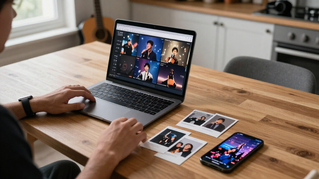
Usually, yes. Many printing services support phone uploads or imports from photo libraries, though available tools vary. A larger screen can make it easier to inspect crops, faces, small text, and spelling before you order.
What resolution should my photos be?
Follow the printer’s guidance for the selected print size and use the highest-quality original you have. If a service shows a low-resolution warning, choose a different image or use the photograph in a smaller area. A phone preview alone does not guarantee the print will look sharp.
Can I add birthdays, anniversaries, or captions?
Often, but customization depends on the product and provider. Check the editor before you choose a template, then proof every date and caption in the final preview. A short note like “First tomatoes, July” can add context without crowding the photograph.
How long does printing and delivery take?
Timing varies by provider, product, destination, and season. Check the current production and shipping estimate, especially around holidays, and leave time to review the design before placing the order. If the gift needs to arrive by a particular date, allow room for a delivery delay.
How can I make a photo gift feel more personal?
Build the design around a shared memory or a clear theme, then choose photographs that the recipient will recognize. Add a meaningful date or a brief caption if the layout allows it, and include a handwritten note explaining why you picked those images. The personal connection often matters more than extra decoration.
Conclusion
Start with the photographs that make you remember a person or place, then build a simple design around that feeling. Check the crop, dates, and delivery details while there’s still time to make a change.
A calendar may hang beside the fridge for a year; a card may be tucked into a drawer long after the occasion. Give your archive a story to tell, and let the people you love find themselves in it.