
TL;DR

Get audio and creator gear delivered free with Prime
- Fast, free delivery on millions of items
- Prime Video, Amazon Music and more included
- Member-only deals all year
Producing a convincing white print at home starts with using a photo printer’s dedicated monochrome mode or a correctly managed ICC profile — never both at once, since double profiling is the number-one cause of green and magenta casts. Paper choice, monitor brightness, viewing light, and clean nozzles each shift neutrality too, so treat the whole chain as one system and always print a small test strip before the final.
You spent an hour perfecting a black-and-white conversion. The image on screen looks gorgeous — deep blacks, silky highlights, pure neutral grays. Then the printer finishes, you lift the sheet, and the shadows are green. Or the whole print leans magenta, like it was dunked in weak tea. I’ve been there more times than I’d like to admit.
Here’s the truth I learned the hard way: printing black and white at home is less about removing color than controlling it. A grayscale file does not guarantee a neutral print. Neutrality is a moving target shaped by your inkset, your paper, your driver settings, and even the light bulb in your hallway.
In this guide I’ll walk you through the complete system I use for exhibition-quality monochrome prints from a desktop inkjet — printer modes, paper choices, calibration, metamerism, and a step-by-step workflow you can follow tonight. Getting truly neutral tones is absolutely achievable at home. You just have to stop fighting the printer and start working with it.
Run color management in exactly one place — application OR printer driver, never both — because double profiling is the leading cause of green and magenta cast…
Use your printer’s dedicated monochrome mode for straightforward neutral prints; switch to an ICC-managed workflow for split toning or papers needing precise p…
Set monitor luminance to roughly 80–120 cd/m² at gamma 2.2 — an overly bright screen is the main reason prints come out darker than expected.
Match the driver’s media type exactly to the paper; it controls ink limits, black-ink selection, and drying, not just color.
Always print a small test strip with highlights, midtones, shadows, and a gradient, and judge it only after it fully dries under the intended display light.
Printing Black and White: Getting Neutral Tones at Home
A grayscale file does not guarantee a neutral print. Neutrality is shaped by your inkset, your paper, your driver settings — and even the light bulb in your hallway. The secret: run color management in exactly one place, treat the whole chain as one system, and always test before the final print.
Why Your “Neutral” Print Turned Green or Magenta
Double Color Management
App and driver both manage color. Two engines fighting over one image almost always produces a cast.
Most commonClogged Nozzle
One partially blocked channel turns a perfect file into a green mess in seconds. Run a nozzle check first.
SneakyWrong ICC or Media Type
Media setting controls ink limits, black-ink selection, and drying — not just color. It must match the paper.
Often missedCMY-Mixed Grays
Single-black printers build gray from cyan, magenta, yellow. Any channel imbalance drifts neutrality.
StructuralPaper Base Tint
Warm-white papers read warmer; bright-white papers cooler. Brightening agents shift under different light.
EnvironmentalEvery print in a set of dune photographs came out with a sickly green shadow. Profile fine. Monitor fine. The culprit: driver color management left on while Photoshop was also managing color. One checkbox. Nine wasted sheets.
Gray Inks vs. One Black Cartridge
The Eyeballed Mix
- Grays mixed from cyan, magenta, yellow droplets
- Neutrality wanders as cartridges age or nozzles weaken
- Fine gradients show banding and faint warmth
- Fine for work prints: at 3 feet, 5×7s fooled a portfolio review
- Dye inks: smooth and glossy, but fade faster by paper and display
The Pre-Mixed Pot
- Photo black, matte black, gray, light gray — actual gray ink
- Continuous, glassy sweep from paper-white to near-black
- Diluted inks = smaller, more controllable dots (like watercolor washes)
- Stable neutrality — the same result every time
- Pigment inks: exhibition longevity, ideal on cotton-rag papers
Print any grayscale ramp twice: once as a color file (CMY-mixed grays), once through dedicated monochrome mode. Under daylight, the monochrome strip looks like polished stone; the mixed strip shows banding and a warmth you can’t unsee.
Printer Mode or ICC Profile?
| Situation | Best Choice → | Why |
|---|---|---|
| Straight neutral B&W print | Driver monochrome mode | Gray inks do the work; simplest path to neutrality, with driver-side tone, brightness, and contrast controls |
| Deliberate split-toned image | ICC-managed workflow | Color management preserves intentional toning faithfully |
| Fine-art paper needing precise profiling | Paper maker’s ICC profile | Profile built for that exact printer–ink–paper combination |
| Custom linearization / specialist software | ICC / third-party tools | Specialist workflows need full control of the tone curve |
| Monochrome mode unavailable or unsuitable | ICC-managed workflow | Application manages color; driver sits idle |
Paper Is Not a Passive Surface
Deepest Blacks
Highest apparent contrast and maximum black density — punchy exhibition look.
Soft & Tactile
Lower maximum black density, but a classic fine-art feel loved for gallery work.
Reads Warmer
The paper’s own tint pushes the entire print toward warmth — plan for it.
Cooler, Light-Sensitive
Optical brighteners boost whiteness under UV-rich light but can shift or age.
Calibrate the Screen — Judge the Print Under Proper Light
An overly bright screen is the main reason prints come out darker than expected. Evaluate under consistent, high-quality light with good spectral coverage — daylight shifts continuously and cheap LEDs exaggerate or hide casts. Always let prints dry and stabilize before judging.
A Reliable Home Workflow You Can Follow Tonight
Run a Nozzle Check
Clean the printhead before blaming anything else. One clogged channel ruins neutrality.
HardwarePick One Color Engine
Application manages color OR the driver does. Disable the other completely.
SettingsMatch Media Type
Set the driver’s media setting exactly to your paper — ink limits and black ink depend on it.
PaperPrint a Test Strip
Highlights, midtones, shadows, and a gradient — small, fast, cheap to repeat.
VerifyJudge Dry, Under Display Light
Only after full drying, under the intended viewing light, make your final call.
Final printBottom line: getting truly neutral tones at home is absolutely achievable. Stop fighting the printer — treat printer, ink, paper, color management, and viewing light as one system, and start working with it.
Why Your ‘Neutral’ Print Turned Green or Magenta
Most color casts in black-and-white prints come from five culprits: double color management, a clogged nozzle, the wrong ICC profile or media setting, grays mixed from colored inks, or the paper’s own base tint. The single most common is double profiling — when both your editing application and the printer driver try to manage color at the same time. Two color engines fighting over one image almost always produces a cast.
Here’s a quick personal example. Last winter I printed a set of dune photographs and every one came out with a sickly green shadow. My profile was fine. My monitor was fine. What I’d missed: the previous owner of that printer preset had left driver color management switched on while Photoshop was also managing color. One checkbox. Nine wasted sheets.
The other sneaky cause is your printer itself. Budget printers with a single black cartridge build their grays by mixing cyan, magenta, and yellow. Any tiny imbalance in those channels — a slightly weak nozzle, a half-empty cartridge — and your gray drifts. Photo printers with multiple gray inks sidestep this almost entirely.
Before you blame the printer, run a nozzle check. One partially clogged channel can turn a perfect file into a green mess in seconds.
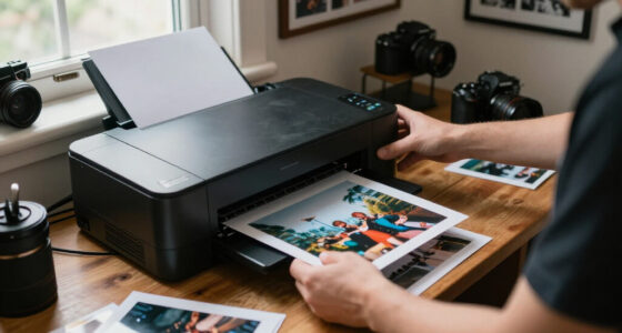
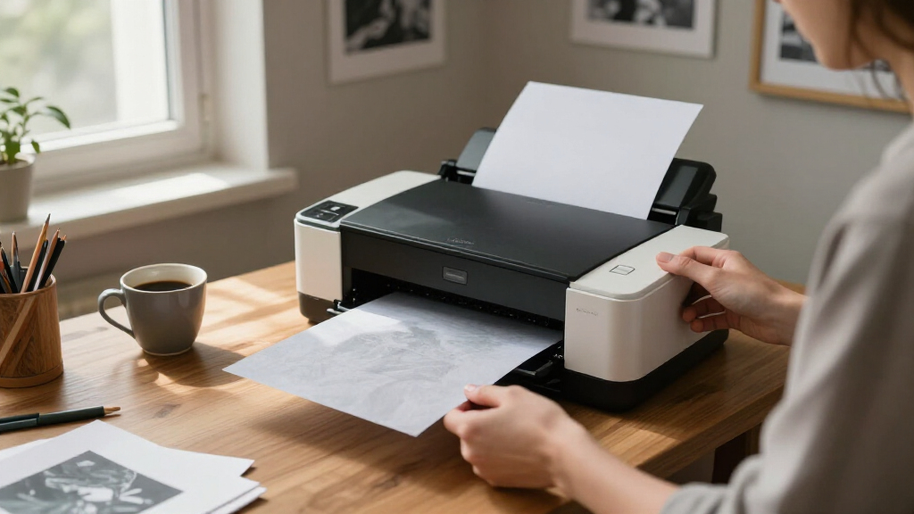
monochrome photo printer with dedicated black and white mode
As an affiliate, we earn on qualifying purchases.
As an affiliate, we earn on qualifying purchases.
Gray Inks vs. One Black Cartridge: What Your Printer Actually Does
Modern pigment-ink photo printers commonly carry photo black, matte black, gray, and light gray cartridges — sometimes more. Those extra dilutions mean smooth gradients come from actual gray ink rather than a dithered mix of colored droplets, which is why multi-ink printers produce both smoother tones and far more stable neutrality.
Think of it like mixing paint. If you ask someone to mix gray from red, blue, and yellow, the result depends entirely on their measuring precision — a drop too much blue and the gray goes cold. Hand them a pot of pre-mixed gray and the result is the same every time. That’s exactly what’s happening inside your printer: a three-color office machine is the person eyeballing the mix; a multi-gray photo printer is the pre-mixed pot. A watercolorist works the same way — diluting pigment into pale washes to build a smooth sky instead of laying down full-strength paint and hoping. Diluted inks place smaller, more controllable dots for the same reason.
I remember my first upgrade from a three-color office printer to a proper photo printer. The difference in a plain gray gradient ramp was humbling. What had been faintly banded and vaguely warm became a continuous, glassy sweep from paper-white to near-black. That’s not marketing — that’s physics.
Here’s a concrete test you can run tonight to see the difference with your own eyes. Download any grayscale ramp image — a smooth horizontal gradient from black to white — and print it twice: once letting the printer mix grays from CMY (print it as a color file with color management on), and once through the dedicated monochrome mode or gray inks. Lay the two strips side by side under daylight. On a multi-gray machine the monochrome strip will look like polished stone; the mixed-ink strip usually shows faint banding and a warmth or coolness you can’t unsee once you notice it.
But don’t dismiss single-black printers entirely. For casual documentary prints, contact sheets, or work prints, a gray built from CMY can be perfectly acceptable. Last year I printed a wall of 5×7 work prints for a portfolio review on an old single-black machine — from three feet away, nobody could tell. It was only when I printed the final 16×20 exhibition pieces that the banding and slight warmth became obvious. Just know the limits: neutrality will wander as cartridges age, and fine gradients will show their seams. If monochrome is your main passion, the gray-ink route is worth every square inch of desk space.
One more distinction that matters: pigment inks versus dye inks. Pigment is generally preferred for exhibition work — better longevity, better behavior on cotton-rag fine-art papers. Dye inks can look wonderfully smooth and glossy but fade faster depending on paper and display conditions. Neither is ‘wrong’; match the ink to the ambition of the print. A dye-ink machine is perfect for a year of family albums; a pigment-ink machine is what you want for a framed print that has to look identical in ten years.
ICC profile for black and white printing
As an affiliate, we earn on qualifying purchases.
As an affiliate, we earn on qualifying purchases.
Printer Mode or ICC Profile? The Decision That Sets Your Neutrality
For most home printers, the dedicated monochrome driver mode — often called Advanced Black and White, Black and White Photo, or simply Monochrome — is the simplest route to neutral output. It leans on the printer’s gray inks and gives you subtle driver-side controls for tone, brightness, contrast, and how highlights and shadows render.
The alternative is a fully color-managed workflow: your application handles color using a paper-specific ICC profile while the driver sits idle. Both routes work. Mixing them does not.
| Situation | Best choice | Why |
|---|---|---|
| Straight neutral B&W print | Driver monochrome mode | Gray inks do the work; simplest path to neutrality |
| Deliberate split-toned image | ICC-managed workflow | Color management preserves intentional toning faithfully |
| Fine-art paper needing precise profiling | ICC profile from paper maker | Profile built for that exact printer-ink-paper combination |
| Custom linearization or specialist software | ICC / third-party workflow | Driver mode may bypass or fight the software |
A word of warning that saves paper: never let both the application and the driver manage color. That double profiling is the classic cause of the cast that ‘wasn’t there last time.’ For important work, test both approaches on small strips — I’ve seen papers where the driver mode was flawless and others where only the profile nailed it.
As an affiliate, we earn on qualifying purchases.
Your Paper Is Never Neutral — and That Changes Everything
Paper is not a passive backdrop. Its base color, coating, brightness, and optical brightening agents all push your print warmer, cooler, or simply different. A warm-white cotton rag makes even a technically neutral print look warm. A bright-white paper with optical brighteners can look crisp and cool under daylight — then shift oddly under warm indoor lighting as the brighteners age or respond differently to the light source.
Surface matters just as much as color. Glossy and luster papers give you deeper apparent blacks and punchier contrast; matte and cotton-rag papers offer that soft, tactile, gallery-print character but with a lower maximum black density. I love printing quiet landscape work on matte rag — but I’d never print a high-contrast night scene on it and expect the same separation I get from luster.
The mistake I see most often from beginners: choosing the wrong media type in the driver. That setting isn’t cosmetic. It controls ink limits, which black ink gets used, printhead height, and drying behavior. If the paper maker says ‘use Matte Paper Heavyweight,’ use exactly that — not the closest-sounding option.
- Glossy / luster / baryta — deepest blacks, crisp separation
- Matte cotton rag — softer contrast, texture, fine-art feel
- Warm-white bases — naturally warmer-looking prints
- Bright-white with OBAs — cooler look, may shift under different light
And remember: the paper’s white is the brightest white your print can ever have. No amount of editing changes that.
monitor calibration tool for photographers
As an affiliate, we earn on qualifying purchases.
As an affiliate, we earn on qualifying purchases.
Calibrate the Monitor — Then Judge the Print in the Right Light
The number-one reason prints come out darker than expected is a monitor running far too bright. Most home displays ship at retina-searing brightness, so you edit down to match the screen — and the print lands in your hand looking like it was printed at midnight. A calibrated and profiled monitor gives you predictable tone and brightness instead of guesswork.
Here’s the practical starting setup I use and recommend:
- White point: D65 (or D50 for print-matching workflows)
- Gamma: 2.2
- Luminance: roughly 80–120 cd/m² — dimmer than feels comfortable at first
- Room lighting: consistent and controlled, not sunlight through a window
But calibration alone won’t save you if you judge prints under bad light. Daylight shifts continuously through the day, and cheap LEDs can exaggerate or completely hide a cast. Evaluate prints under a consistent, good-quality light source — ideally the same illumination where the print will hang.
Two habits that changed my printing: soft-proofing before printing, so the paper’s reduced contrast and white point don’t surprise me, and letting prints cure before judging them. Fresh ink looks different from settled ink — give it hours, or a full day for critical work. I once nearly re-edited a print because the blacks looked flat twenty minutes out of the printer. By morning, they’d deepened beautifully on their own.
Metamerism: Why Your Print Changes Color in the Next Room
Metamerism is the effect where a print looks neutral under one light source and colored under another. It’s especially noticeable in black-and-white prints made partly from colored inks, and it’s the reason a print that looks perfect by your window looks faintly pink under the kitchen’s warm bulb.
Multiple gray inks have reduced this problem dramatically on modern photo printers — but not eliminated it. Paper fluorescence, residual colored-ink participation, and the spectral quirks of your viewing light all contribute. Think of it as a three-way conversation between ink, paper, and lightbulb; change any one and the answer changes.
The fix isn’t technical — it’s behavioral. Before committing to a final print, test it under three lights: daylight, your warm household lighting, and the light where the print will actually hang. If it stays neutral across all three, you’re done. If not, try a gray-ink-focused workflow, a different paper (OBA-heavy papers are frequent offenders), or standardize the display lighting.
A print can be technically neutral and still appear warm or cool. The paper and the viewing light get the final word.
A Reliable Home Workflow You Can Follow Tonight
Here is the sequence I run for every important monochrome print. It’s boring, repeatable, and it works — which is exactly what you want when paper and ink cost real money.
- Calibrate and profile your monitor.
- Edit from a high-bit master file in a large working space, with a full but controlled tonal range.
- Resize to the final physical print dimensions.
- Apply output sharpening suited to your paper and print size.
- Install the paper manufacturer’s current ICC profile if you’re using application-managed color.
- Choose the printer’s monochrome mode or the ICC workflow — never both.
- Select the exact recommended media type and an appropriate quality setting.
- Print a small test strip with real highlights, midtones, shadows, and a smooth gradient.
- Let it dry and stabilize, then judge it under the intended viewing light.
- Make corrections as print-specific adjustment layers — don’t blindly alter your archival master.
That test strip step saves me money every single month. A strip costs a fraction of a full sheet and tells you everything: shadow separation, cast, overall brightness, banding. And resist the temptation to change five settings between prints — adjust one variable at a time, or you’ll never know what fixed (or broke) the result.
Before important sessions, also run a nozzle check and print regularly enough that the printer doesn’t sit idle for weeks. Repeated unnecessary cleaning cycles waste ink and fill the maintenance tank faster, so check first, clean only when needed.
Fixing the Most Common Failures: A Troubleshooting Table
When a print goes wrong, the cause is usually one of a familiar handful. Here’s the cheat sheet I keep taped inside my paper cabinet — every problem I actually encounter, with what fixed it.
| Problem | Likely causes | Fix |
|---|---|---|
| Green or magenta cast | Double profiling, clogged nozzle, wrong profile | Run a nozzle check; disable duplicate color management; use correct profile or monochrome mode |
| Print too dark | Monitor too bright, dim viewing light, crushed shadows | Lower display luminance; improve viewing light; soft-proof and adjust |
| Weak or muddy blacks | Matte paper, wrong media setting, limited gamut | Verify media setting; accept the paper’s character or move to glossier stock |
| Banding in gradients | Low-res file, 8-bit artifacts, clogged nozzles, draft mode | Work from high-bit files; check nozzles; use a higher-quality mode |
| Neutral in daylight, colored indoors | Metamerism or brightener-heavy paper | Use a gray-ink workflow; test other papers; standardize viewing light |
| Blocked shadows | Excess contrast, unsuitable profile, heavy ink load | Soft-proof; selectively lift the deepest tones; verify media settings |
| Warm-looking print | Warm paper base or driver toning | Use a whiter paper or adjust the driver’s tone control |
| Bronzing or gloss differential | Ink-paper interaction, excess ink | Use a supported paper/profile; allow full curing time |
Notice how many fixes circle back to the same three places: color management, media settings, and nozzles. Ninety percent of monochrome printing problems live in that triangle. And don’t assume every image needs paper-white highlights and maximum black — high-key, low-key, and matte fine-art interpretations deliberately use a narrower tonal range, and they’re better for it.
Frequently Asked Questions
Why does my black-and-white print have a color cast?
The usual causes are double color management, an incorrect ICC or media setting, a clogged nozzle, grays mixed from colored inks, the paper’s base tint, or your viewing light. Start with a nozzle check, then confirm that either your application or the printer driver is managing color — never both.
Should I convert my image to grayscale before printing?
Not necessarily. Many photographers keep the file in RGB because printer drivers, ICC workflows, and toning controls often expect RGB data. The image can look perfectly monochrome while the file technically stays color — the printer doesn’t care, and it keeps your toning options open.
Is ‘black ink only’ mode the most neutral option?
It avoids colored-ink casts, but it often produces coarser dots, reduced tonal smoothness, and limited density control. A well-designed multi-gray monochrome mode almost always gives better photographic results — smoother gradients and more stable neutrality.
Why are my prints darker than what I see on screen?
Your monitor is probably brighter than your print’s viewing environment. Lower the display luminance to around 80–120 cd/m², keep your print-evaluation lighting consistent, and soft-proof before printing so the paper’s actual white point and contrast don’t surprise you.
Do I need a custom ICC profile?
Usually not. Manufacturer profiles are typically sufficient when your printer, ink, and settings match their recommendations. A custom profile becomes worthwhile when you need maximum consistency, you’re using a third-party paper without a good profile, or measurable inaccuracies remain after checking the rest of your workflow.
What resolution should I use for black-and-white prints?
Prepare the file at final print dimensions at roughly 240–360 pixels per inch for high-quality photographic output. Lower values can still work for large prints viewed from a distance. Remember that printer DPI and image PPI are different things — one describes ink-dot placement, the other your source pixels.
How long should I wait before judging a print?
At minimum, wait until the surface is fully touch-dry. For critical evaluation, profiling, framing, or stacking prints, allow several hours or about a full day. Fresh ink genuinely looks different from cured ink — I’ve seen blacks deepen noticeably overnight.
Conclusion
Neutral black-and-white printing isn’t a single setting — it’s a system. Printer, ink, paper, color management, and viewing light all get a vote, and the moment you respect all five, the casts disappear and the tones settle into place. Start with the one-rule foundation: color management lives in one place only, and everything else gets adjusted one variable at a time.
Print a test strip tonight. Hold it under the lamp where the photograph will actually live. If it stays neutral there — that’s the print that matters.
Halloween Picks
halloween
As an affiliate, we earn on qualifying purchases.