TL;DR

Get audio and creator gear delivered free with Prime
- Fast, free delivery on millions of items
- Prime Video, Amazon Music and more included
- Member-only deals all year
Creating a Gallery Wall From Your Own Photographs starts with a tight photo edit, a layout matched to the room, and consistent visual details such as mats, frame colors, or print tones. Test the full arrangement with paper templates, keep most gaps between 2 and 4 inches, and hang the collection as one composition rather than treating each frame separately.
Your best photographs should not spend their lives glowing for three seconds on a phone screen. A thoughtful gallery wall turns those buried files into a daily encounter: the blue hush of an early beach walk, your father’s crooked smile, or the sharp shadow of a bicycle crossing a Lisbon street. The result feels personal because you made the photographs, chose the moments, and decided how their story unfolds.
The hard part is rarely driving a nail into plaster. It is knowing which pictures belong together, how large to print them, and why an arrangement that looked tidy on the floor suddenly feels scattered on the wall. In my print work, I treat the whole display as one large composition, using the same instincts I use inside a camera frame: balance, rhythm, contrast, and intentional empty space.
This guide walks you through editing your photographs, preparing dependable print files, choosing a layout, pairing frames and mats, and hanging everything without covering the wall in abandoned holes. You will also see where mixed media, captions, and digital displays can help—or distract. By the end, you will have a practical plan to create a display that feels finished but still alive, ready to grow as you make new photographs.
Edit down to one emotional thread, using a single anchor photograph and quieter supporting images rather than displaying every favorite.
Order small proof prints and inspect them in the room’s morning and evening light before producing the full set.
Choose a grid for matching photographs, an organic cluster for mixed sizes, or a ledge when you want to rotate images often.
Test the whole arrangement with full-size paper templates and keep most frame gaps between 2 and 4 inches.
Review the wall every 6–12 months for loose fixings, fading, crooked frames, and photographs that no longer support the story.
Choose Photos That Tell One Clear Story
Creating a Gallery Wall From Your Own Photographs starts with a disciplined edit, not a frame purchase. Choose images that share one emotional thread, then vary their distance, orientation, and energy. A strong collection needs connection and contrast: enough similarity to feel related, with enough change to keep your eye moving.
A gallery wall is a curated arrangement of photographs and other visual pieces that creates a focal point and tells a personal story [1]. The word curated matters. If you include every pleasant photograph from a trip, the wall becomes a storage shelf; if you select the few frames that carry the trip’s pulse, it becomes a visual narrative.
For instance, imagine editing 600 photographs from a week in Scotland. You might choose a wide frame of mist rolling over Glen Coe, a close photograph of rain beads on a red jacket, a quiet pub portrait, and a small detail of muddy boots beside a stone doorway. Those four images carry weather, place, people, and texture without repeating the same mountain view.
- Start with 20 candidates: Put them in one folder or spread small proofs across a table so you can judge relationships rather than isolated favorites.
- Remove near-duplicates: Two similar sunsets compete with each other. Keep the one with the cleaner horizon, stronger gesture, or richer color.
- Find a visual anchor: Choose one photograph with enough scale, detail, or emotional weight to lead the arrangement.
- Add supporting frames: Use quieter images—hands, doorways, shadows, or small portraits—as pauses around the anchor.
- Check the color rhythm: Repeat a blue coat, warm skin tone, or deep green in two or three places so the eye finds a path.
You can mix portraits, landscapes, color, and black-and-white photographs, but each change should serve the story. A monochrome street image can sit beside a color portrait when both share hard side light or a similar shape. Think of the edit as a dinner table: every guest can have a different personality, yet someone needs to guide the conversation.
As an affiliate, we earn on qualifying purchases.
Make Every Print Look Like It Belongs on the Wall
Creating a Gallery Wall From Your Own Photographs looks polished when the prints share dependable brightness, color, and paper character. Prepare each file for its intended size, inspect shadow detail, and order small test prints before committing to the full set. Consistent printing acts like good lighting on a stage: it lets every photograph speak clearly.
Screen brightness causes many first-time printing disappointments. A glowing display can make a dim file appear lively, while the finished print reflects room light and may look heavy or muddy. Lower your monitor to a comfortable working brightness, edit in steady light, and inspect whether faces retain detail and dark clothing stays separated from the background.
Match resolution to the final dimensions rather than exporting every file at one arbitrary setting. At 300 pixels per inch, an 8-by-10-inch print uses 2400 by 3000 pixels, although a well-prepared file can still look convincing at a lower resolution when viewed from across a room. Do not enlarge a tiny social-media copy if the original camera file still exists; start with the highest-quality original.
Paper choice changes the voice of an image. Glossy surfaces deepen blacks and make saturated city lights snap, but they also catch window reflections and fingerprints. Matte or lightly textured paper softens glare and often suits portraits, pale landscapes, and rooms with large windows; the tradeoff is a gentler black and a more tactile, subdued finish.
For example, a night photograph of a wet Tokyo crossing can sing on a smooth lustre paper, where red signs and blue reflections feel almost liquid. A foggy woodland photograph may gain more from matte paper, where soft fibers echo bark and mist. Order both as small proofs, place them against the actual wall for a day, and judge them in morning and evening light.
Judge prints in the room where they will hang. A color that feels warm under daylight can turn amber beneath a household bulb, while glass reflections can hide the very shadow detail you worked to preserve.
As an affiliate, we earn on qualifying purchases.
Pick the Layout That Fits Your Room and Your Photographs
Creating a Gallery Wall From Your Own Photographs becomes easier when the layout matches both the room and the image set. Choose a grid for order, an organic arrangement for variety, or a ledge for frequent changes. The right structure is a visual container, much like a contact sheet holding different frames together.
A narrow hallway often benefits from a clean horizontal line because people see it while moving past. A broad wall above a sofa can support a looser cluster with one large anchor. According to PhotoMocha, symmetrical grids create a clean, organized effect, while asymmetrical arrangements feel more dynamic and depend on careful planning [1].
| Layout | Works best for | Main strength | Watch for |
|---|---|---|---|
| Symmetrical grid | Matching sizes, portraits, or a single series | Calm rhythm and easy visual order | Small measuring errors become obvious |
| Organic cluster | Mixed sizes, travel stories, and family archives | Energy, variety, and room to grow | Too many equal-sized gaps can feel mechanical |
| Horizontal line | Hallways, stair landings, and low furniture | Guides the eye through a long space | Frames can feel stranded if the line is too sparse |
| Picture ledge | Rotating displays and rental homes | Easy rearrangement with fewer wall holes | Overlapping frames may hide key image details |
Scale the outside boundary to the furniture below it. Above a 72-inch sofa, for example, a group spanning roughly 45 to 55 inches often feels connected to the seat rather than floating like a small island. Tape that boundary on the wall first; the blue painter’s tape may look plain, but it reveals scale problems immediately and gives you a clear working area.
Your photographs should guide the final choice. Nine quiet architectural studies with repeated straight lines will usually suit a grid. A family story containing one large wedding portrait, two small childhood snapshots, and several travel scenes may feel warmer in an organic cluster built around shared faces and colors.
Stand at the room’s usual viewing point before deciding. A stairway arrangement must read from below and halfway up the steps, while a dining-room wall often sits behind chairs, flowers, and moving guests. The best layout supports how you actually use the space, not just how the empty wall looks in a straight-on photograph.
As an affiliate, we earn on qualifying purchases.
Use Frames and Mats to Turn Variety Into a Cohesive Display
Frames and mats make mixed photographs feel related by repeating a few controlled details. Keep at least one element consistent—such as frame color, mat tone, or profile width—and let other elements vary with purpose. This shared detail works like a steady bass line beneath different melodies.
Uniform black frames can pull family snapshots, landscape photographs, and graphic street scenes into one clean group. Natural wood adds warmth beside linen, clay, and leafy plants, while pale frames can sit quietly against a dark painted wall. Mixed frames also work, but repeat each material at least twice so no single frame looks like an accidental leftover.
Mats create breathing room between the photograph and its frame. A generous white or warm-white mat can give a small image more presence, while a narrow mat keeps the display denser. Avoid assuming that bright white suits everything; beside a creamy fiber paper, it can make the print look yellow, while an off-white mat may support the image’s paper tone more gracefully.
For instance, suppose you have a 5-by-7-inch photograph of your grandmother laughing at a kitchen table. Printing it larger may expose softness or motion blur, but placing the original size inside an 11-by-14-inch frame gives it weight without pretending it contains more detail. The surrounding mat becomes quiet space around the memory, much like silence before an important line in a song.
Protect valuable or irreplaceable prints with acid-free mat board, a suitable backing, and glazing that blocks much of the ultraviolet light reaching the print. Even then, avoid prolonged direct sun and damp walls. Bathrooms can hold inexpensive, replaceable prints, but steam and condensation make them a poor home for an archival photograph or treasured one-off darkroom print.
Recent display styles include repurposed frames, sustainably sourced materials, canvases, and screens mixed with traditional prints [2]. Use those options as accents rather than obligations. A small digital frame can rotate through newer family photographs, while the surrounding paper prints provide stillness and texture; mute sudden animations or bright screens so technology does not overpower the wall.
As an affiliate, we earn on qualifying purchases.
Hang the Full Arrangement Without Guesswork or Extra Holes
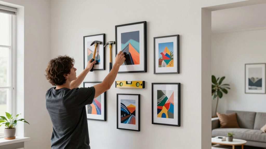
A clean installation comes from testing the complete arrangement before making a single hole. Build paper templates for every frame, mark each hanging point, and keep the gaps within a deliberate range. Most displays feel connected at 2–4 inches apart, although frame size and wall scale should guide the final rhythm [1].
- Trace every frame. Lay each frame on kraft paper, trace its outside edge, cut the shape, and label it with the photograph’s name.
- Mark the hardware position. Measure from the frame’s top edge to the taut hanging wire or fixed hook, then transfer that mark to the paper.
- Tape the templates to the wall. Start with the anchor image, add neighboring shapes, and view the group from the doorway and the main seat.
- Check spacing and level lines. Use a tape measure and level, but also trust your eye when uneven frames create a more natural balance.
- Install suitable fixings. Match hooks, screws, or anchors to the wall material and the actual frame weight, then hang the largest pieces first.
- Make the final adjustment. Straighten each frame, add removable rubber bumpers at the lower corners, and clean the glazing after handling.
Paper templates turn an abstract plan into a full-size rehearsal. For example, a seven-frame cluster may look balanced on the floor yet feel too low above a sideboard once furniture enters the composition. Leave the templates up overnight; seeing them in passing often reveals awkward gaps that disappear when you stare at the wall for ten straight minutes.
Measure spacing from frame edge to frame edge, not from each frame’s center. Two inches creates a compact, energetic cluster, while four inches gives large photographs more air. If one gap jumps to seven inches, the wall can split into separate islands unless a shelf, caption, or small object bridges the distance.
Check for pipes and electrical cables before drilling, and use anchors rated for the frame’s weight and wall type. If the wall is old, unusually hard, or hollow in unexpected places, ask a qualified local professional rather than forcing the fixing.
A common height guide places the center of artwork near average eye level, often around 57–60 inches from the floor. Furniture changes that decision. Above a sofa or console, the lower edge commonly looks connected when it sits roughly 6–10 inches above the furniture, with enough clearance for people, lamps, and cushions.
Add Personal Details Without Letting the Story Become Clutter
Your wall gains personality when every extra detail adds information that the photographs cannot carry alone. Add short captions, small objects, or one contrasting medium, then stop before those additions compete with the images. Think of them as seasoning: a little sharpens the story, while too much hides its natural flavor.
A gallery wall from your own archive can include more than polished camera files. A handwritten recipe beside a kitchen portrait, a train ticket near a travel photograph, or a child’s drawing beside a family scene can connect the image to a particular time and place. Use copies when the original object is fragile, valuable, or likely to fade.
For instance, an arrangement of photographs from a coastal road trip could combine a wide photograph of slate-gray water, a small portrait at a café window, and a scanned map with the route marked in red. The map gives the photographs geography and sequence; a jar of shells glued to the wall would add weight, dust, and a weak fixing problem without adding much meaning.
Captions work best when they stay brief and specific. A line such as North Sea, 6:12 a.m., October 2025 gives you weather, time, and place without explaining what the viewer should feel. Print captions on the same paper stock or use matching label holders so they read as part of the design, not museum labels borrowed from another room.
Mixed media and digital photo displays have become common ways to update a traditional arrangement [2]. If you add a screen, choose slow image changes and match its brightness to the paper prints. A brilliant display cycling every five seconds becomes a television; a dimmer screen changing every few minutes can act as a living album within a quieter wall.
Leave one area with room to grow. You may add a new portrait after a birth, replace a travel photograph after another journey, or rotate a seasonal color set. A gallery wall should feel edited rather than frozen, carrying your history without becoming a crowded archive of every event.
Keep Your Gallery Wall Straight, Clean, and Easy to Update
A gallery wall stays attractive when you treat it as a working collection rather than permanent scenery. Dust the frames, check the fixings, watch for fading, and review the edit every 6–12 months. Small maintenance sessions protect the prints and keep crooked frames or tired images from slowly becoming part of the room.
Use a clean microfiber cloth on frames and glazing, following any care instructions supplied with the material. Spray cleaner onto the cloth rather than toward the wall, frame seams, or photograph. Moisture that creeps behind glazing can stain a mat, buckle paper, and leave the print with a wavy surface that catches every side light.
Check frames after doors slam, floorboards shift, or seasonal humidity changes. Small clear bumpers on the lower corners help frames stay level, especially in busy hallways. If a wire stretches or a hook loosens, replace it before the frame begins leaning forward; a five-minute repair is kinder than finding broken glass on the floor.
Sunlight moves through a room across the year. A wall that receives soft winter light may sit under a hard summer beam for two hours each afternoon. Watch for uneven fading, especially in dye-based prints, and move vulnerable photographs or close a blind during the strongest light rather than assuming protective glazing makes them invincible.
For example, you might notice that the family portrait once anchoring the group no longer matches the newer, quieter photographs around it. Move it to a bedroom, replace it with a recent image, and keep the same frame so the spacing remains intact. Editing the display is not rejecting a memory; it is giving the current story room.
Store removed prints flat in archival sleeves or boxes, away from damp, heat, and direct light. Label the back or sleeve with the file name, print date, paper, and dimensions. That simple record turns future changes into an easy afternoon project rather than a search through unlabeled files and mystery-sized mats.
Frequently Asked Questions
How many photographs should I use for a gallery wall?
Start with five to nine photographs for a medium wall, then adjust for frame size and available space. A three-frame group can suit a narrow hallway, while a large living-room wall may hold 12 or more pieces if spacing and visual repetition keep them connected.
Should every frame be the same color and size?
No. Matching frames create a calm, formal look, while mixed sizes and materials feel more relaxed. If you mix frames, repeat one detail—such as black edges, warm wood, or off-white mats—so the display has a visible family resemblance.
What spacing looks best between gallery wall frames?
Two to four inches works for many arrangements [1]. Use gaps near two inches for a dense cluster and wider gaps for large photographs, then check the result from the room’s normal viewing position because wall scale changes the effect.
Can I mix color and black-and-white photographs?
Yes, when another element links them. Repeat similar lighting, shapes, subjects, or frame treatments; for example, a black-and-white portrait can sit beside a color street scene when both use strong window light and deep shadows. The connection should feel intentional rather than random.
How do I stop prints from fading on the wall?
Keep prints away from prolonged direct sunlight, use suitable archival materials, and choose glazing with ultraviolet protection when the photograph matters deeply. Check the wall as the seasons change, since the path of sunlight can shift and expose a print that previously sat in soft indirect light.
What is the easiest gallery wall option for a rental home?
A properly installed picture ledge lets you overlap and rearrange framed photographs while limiting the number of wall fixings. Where the lease and frame weight allow, approved removable hanging products may suit smaller pieces, but follow their load limits and test them on the actual wall finish.
Conclusion
The strongest gallery wall is not the one with the most expensive frames or the largest number of photographs. It is the one with a clear edit, dependable prints, and spacing that lets the collection breathe as a single composition. Start with one anchor image, surround it with photographs that add a new beat, and test everything at full size before reaching for a hammer.
Your wall does not need to look like a showroom. It should feel like your eye and your history made visible: a line of familiar faces, rain-dark streets, warm kitchen light, and places you still remember by their smell. Print the photograph you keep returning to, place its paper outline on the wall, and let that first frame begin the story.
Halloween Picks
halloween
As an affiliate, we earn on qualifying purchases.