
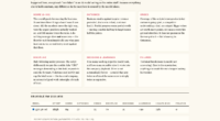
TL;DR

Get audio and creator gear delivered free with Prime
- Fast, free delivery on millions of items
- Prime Video, Amazon Music and more included
- Member-only deals all year
Use cards for self-contained, peer-level items that people need to browse, filter, or select. Keep every card’s hierarchy, spacing, imagery, and actions consistent; choose a list for rapid text scanning and a table for exact attribute-by-attribute comparison.
A polished card grid can feel like a carefully edited contact sheet—clean thumbnails, clear labels, and an obvious next move. It can also feel like a kitchen drawer stuffed with loose batteries, old keys, and mystery cables. The difference comes from what you put inside each card, why the card exists, and how quickly someone can read it.
Here, card means an interface component, not an SD or CFexpress memory card. Cards are self-contained interface components that group related content and actions into recognizable units. You see them in photo galleries, project dashboards, article archives, and media libraries because they let your eyes jump from one item to the next.
I approach card design much like arranging images for a client proofing gallery. You remove anything that distracts from the decision, keep the sequence predictable, and give every image enough breathing room. This guide shows you when cards genuinely help, when another layout works better, and how to build a clear, accessible card system that survives long titles, small screens, missing photographs, and real human behavior.
Use a card only when it represents one self-contained item within a peer-level collection.
Choose lists for fast text scanning and tables for exact comparisons across repeated attributes.
Keep content order, spacing, image treatment, and action placement consistent before chasing equal heights.
Make the whole card clickable only when it has one clear destination and accessible keyboard behavior.
Test long titles, missing media, loading, error, selected, disabled, narrow-screen, zoomed, and large-text states.
Formatting Cards the Right Way (and When)
Use cards for self-contained, peer-level items that people need to browse, filter, or select. Keep their hierarchy predictable, then choose a list for rapid text scanning or a table for exact comparison.
Match the layout to the reader’s task.
Ask what people need to compare. Cards support loose comparison of whole items. Lists support fast scanning along one stable line. Tables expose repeated attributes for precise, row-by-row judgment.
Card grid
Choose cards when imagery aids recognition and every item can stand alone, move, filter, or appear in another context.
Example: portrait sessions by cover photographList
Choose a list for text-heavy, chronological, sequential, or frequently scanned content with minimal visual variation.
Example: a chronological file-ingest logTable
Choose a table when readers must compare the same fields across every item, such as capacity, status, and verification date.
Example: twenty photography archivesUse a card when the item can move, filter, or stand alone. Skip it when the content depends on what comes immediately before it or when a simple section already communicates the grouping.
Give every card the same readable path.
A polished grid behaves like a carefully edited contact sheet: predictable framing, clear labels, enough breathing room, and an obvious next move. Consistent order makes varied content easier to compare.
Autumn Portrait Session
Client selects are ready for final review and download.
Open galleryRelative visual emphasis
The fashionable choice is not always the useful one.
A grid helps when shape, color, or imagery carries meaning. It slows readers down when the real task is comparing the same exact field across many records.
| Format | Use it when | Practical example | Primary tradeoff | Task fit |
|---|---|---|---|---|
| Card grid | Items are peers and imagery supports recognition. | Browsing portrait sessions by cover photograph. | Uses more space and slows dense comparison. | Browse |
| List | Text, sequence, dates, or rapid scanning matter most. | Reading a chronological file-ingest log. | Offers less room for visual identity. | Scan |
| Table | The same fields must be compared across every item. | Checking archive capacity and backup status. | Requires careful narrow-screen handling. | Compare |
| Carousel | Horizontal browsing is natural and hidden items are acceptable. | Showing a small set of optional visual themes. | Conceals choices and weakens discoverability. | Explore |
Run the seven-step card check.
A reliable review connects purpose, hierarchy, interaction, content extremes, accessibility, responsive behavior, and speed. Test the system with real disorder—not only perfect mockup content.
Does each card represent one recognizable peer-level item?
Can the title, metadata, detail, and action be read instantly?
Is the main destination clear without nested controls?
Do long titles, missing media, and absent data behave well?
Are focus states, link meaning, zoom, and large text supported?
Does the grid lose columns before content becomes cramped?
Are images sized well and loading, error, and disabled states clear?
Traceability: from content model to confident action
Consistency of content order matters more than identical card height.
Preserve useful information before preserving symmetryGive Each Card One Job Your Reader Can Name
Formatting cards the right way starts with one rule: each card must represent one recognizable thing that can stand beside its peers. Cards are self-contained interface components that group related information and actions. They work best for collections of products, articles, projects, profiles, or photographs that people need to browse, filter, or select.
Think of a photographer’s contact sheet. Each frame has its own boundary, but every frame belongs to the same shoot and follows the same visual language. A card collection works the same way: each item stands alone, while the repeated structure makes the whole collection easy to scan.
Imagine a studio archive containing twelve recent jobs. One card can show a cover image, project name, shoot date, delivery status, and a link to open the gallery. That is a complete conceptual unit, and rearranging it among the other jobs does not break its meaning.
A continuous backup tutorial is different. Breaking every paragraph into a raised box leaves you with a screen full of frames but no reading flow, rather like mounting every sentence in its own photo frame. Use ordinary headings and paragraphs when the reader needs a single continuous narrative, and reserve cards for independent peer-level items.
- Use a card when an item can move, filter, or stand alone.
- Skip the card when the content depends on what comes directly before it.
- Avoid nested cards when spacing and headings already show the grouping.
- Question a lone card when a simple section would communicate the same idea.
A card is an organizational tool, not a decorative border waiting for content.
As an affiliate, we earn on qualifying purchases.
Choose Cards, Lists, or Tables Without Making Readers Work
Formatting cards the right way includes knowing when another format will serve the reader better. Choose cards for visual browsing, lists for compact or sequential reading, and tables for exact comparisons across repeated attributes. Use a carousel only when hidden off-screen items will not block a decision.
| Format | Use it when | Practical example | Main tradeoff |
|---|---|---|---|
| Card grid | Items are peers and imagery aids recognition | Browsing portrait sessions by cover photograph | Uses more space and makes dense comparison slower |
| List | Text, sequence, dates, or rapid scanning matter most | Reading a chronological file-ingest log | Offers less room for visual identity |
| Table | The same fields must be compared across every item | Checking archive name, capacity, last backup, and verification date | Needs careful handling on narrow screens |
| Carousel | Horizontal browsing is natural and omitted items are acceptable | Showing a small set of optional visual themes | Conceals choices and weakens discoverability |
Suppose you manage twenty photography archives. Cover images and project titles suit cards when you are trying to recognize the Alvarez wedding or the blue-hour architecture shoot. If you need to compare last verified dates, storage totals, and backup states across all twenty archives, the same cards become slow, and a sortable table gives you the answer faster.
Lists usually beat grids for rapid text scanning because your eye follows one stable vertical line. A news archive, activity feed, or sequence of upload errors rarely needs large visual containers. A grid helps when shape, color, or imagery carries meaning, much as thumbnails help you spot the frame with the red umbrella before you read its filename.
The practical test is simple: ask what the reader must compare. If they compare whole items loosely, cards work well. If they compare the same exact field across many rows, use a table even when cards would appear more fashionable.
As an affiliate, we earn on qualifying purchases.
Build a Reading Order People Understand in Seconds
Formatting cards the right way gives every card the same readable path: optional image or status, strong title, quieter metadata, short supporting detail, and clearly placed actions. The title should carry the most visual weight, while dates, categories, and status labels support rather than compete with it.
I think of this hierarchy like packing a camera bag before a fast-moving assignment. Your camera body has an obvious place, batteries live in one pocket, and memory cards stay in another. When every item has a predictable position, you act without rummaging; when card content follows a predictable order, your reader scans without hunting.
For a gallery card, you might show a 3:2 cover photograph, the title Autumn Portrait Session, the date and image count, a one-line delivery note, then an Open gallery action. Repeat that order across the collection. Moving the date above the title on one card or placing the action beside the image on another breaks the rhythm.
Real content will fight neat mockups. A title such as Saturday Ceremony and Rain-Soaked Evening Reception needs more room than Studio Tests, while a missing image can collapse the whole composition if you have no fallback. Set line-based limits, define a consistent placeholder, and reserve space for optional badges only when alignment helps comparison.
- Keep titles in one consistent position and allow useful wrapping.
- Use metadata for supporting facts, not the main decision.
- Place the primary action consistently after the content.
- Test missing images, absent dates, long status labels, and large numbers.
Equal height can make a grid calm and tidy, but symmetry is not worth hiding a deadline, warning, or full project name. Consistent order matters more than identical height. When information affects a decision, show it or provide a direct path to the complete text.
accessible interface card templates
As an affiliate, we earn on qualifying purchases.
As an affiliate, we earn on qualifying purchases.
Make Every Click and Keyboard Move Feel Obvious
A card should become one large click target only when it has one clear destination. Use a proper link for navigation, retain a visible keyboard-focus state, and keep secondary buttons independent. If the card contains several equally weighted actions, leave the container static and make each control explicit.
Consider a client gallery card with an Open gallery destination plus separate download, share, and archive controls. Wrapping the entire card in one link and placing three buttons inside it creates muddled interaction. A hurried tap near the download icon can open the gallery instead, while keyboard and screen-reader behavior becomes harder to follow.
A cleaner version links the descriptive title, enlarges the main destination through a carefully built click area, and leaves the other controls outside that link. Avoid repeating the same destination through the image, title, and a generic Read more button. Those repeated links add noise to the accessibility tree without giving the reader a new choice.
According to the W3C’s WCAG 2.2 Target Size (Minimum) criterion, interactive targets should measure at least 24 by 24 CSS pixels, apart from listed exceptions. That number is a floor, not a design ambition. On a phone used with cold fingers outside a venue, generous spacing and a larger tap area can prevent the wrong project from opening.
Never rely on hover, color, or an image alone to communicate an action or status.
A selected card needs more than a blue border. Add a checkmark, a visible Selected label, and the programmatic state that assistive technology can announce. Give meaningful images useful text alternatives, hide purely decorative art from assistive tools, and respect reduced-motion preferences when cards animate.
As an affiliate, we earn on qualifying purchases.
Keep Cards Readable on Phones, Tablets, and Wide Screens
Responsive cards should preserve a minimum usable width and flow into fewer columns as their container narrows. Do not squeeze a four-column desktop grid into tiny boxes on a phone. Let content length and available space determine the layout, while keeping text, images, and controls comfortable to read and tap.
At roughly 390 pixels wide, a single-column layout often gives a title, thumbnail, and action enough room to breathe. Around tablet width, two columns may work; on a broad desktop container, three or four may fit. Those counts are starting points, not fixed rules, because a card containing six metadata fields needs more width than a simple photo tile.
CSS Grid patterns built around minmax() can let cards reflow when they reach their usable minimum. Container queries go a step further by reacting to the card’s parent rather than the whole viewport. That helps when the same project card appears in a wide archive page and a narrow dashboard panel.
Test with awkward content before you admire the tidy version. Replace a short title with Three-Day Coastal Campaign with Separate Editorial and Social Deliveries, remove its image, add two status labels, and increase text size. This resembles checking the edges of a photograph at 100 percent: small flaws become visible before a client finds them.
Fixed heights improve row alignment but can cut off information. Flexible cards preserve the full content but may create uneven lower edges. Choose based on the task: visual rhythm can guide a browsing gallery, while complete dates, warnings, and backup states matter more in an operational archive view.
Use Images Without Slowing the Whole Collection
Card images should help the reader recognize, evaluate, or feel the item; otherwise, leave them out. Reserve each image’s dimensions before loading, serve an appropriately sized file, and defer off-screen media. A text-only card is often clearer than one carrying a decorative thumbnail with no useful meaning.
In a portrait archive, a cover photograph can identify a session faster than a folder name. You may spot the crimson coat, pale winter grass, and soft gray sky before you read a word. In a backup-status dashboard, that same photograph competes with the last verified date and adds bytes without helping the immediate decision.
Define one aspect ratio, cropping rule, focal position, fallback treatment, and missing-image behavior for the collection. A mixture of tall portraits, wide panoramas, and square thumbnails can make card rows jump like uneven frames on a crooked gallery wall. Use a stable media box and crop thoughtfully rather than stretching photographs or allowing their dimensions to shift the layout.
According to web.dev’s Core Web Vitals guidance, a good Cumulative Layout Shift score is 0.1 or lower at the 75th percentile of page visits. Reserving image space helps protect that score. It also stops the button under a loading thumbnail from sliding beneath someone’s finger just as they tap.
Lazy-load images below the fold, but give prominent opening imagery the priority it needs. For hundreds or thousands of cards, use pagination or virtualization rather than building every hidden item at once. Keep skeletons close to the final card’s shape so the finished content appears like a print settling into its mount, not furniture being dragged across the room.
Run This Seven-Step Check Before Your Cards Ship
A reliable card review checks purpose, hierarchy, interaction, content extremes, accessibility, responsive behavior, and speed as one connected system. Review the collection with real material and every major state, not one polished sample. The goal is to see whether a reader can identify an item and act without hesitation.
- Name the card’s single concept. If you need a sentence joined by several unrelated ideas, the card may contain too much.
- Identify the reader’s task. Decide whether they are browsing, scanning, comparing exact values, selecting, or taking action.
- Set the content order. Keep titles, metadata, descriptions, and controls in repeatable positions across every variant.
- Load hostile content. Try a long title, missing image, translated label, large number, multiple statuses, and user-written text.
- Test every state. Review loading, empty, error, selected, completed, unavailable, and disabled versions.
- Use more than a mouse. Tab through the interface, activate controls from the keyboard, enlarge text, and inspect high-contrast behavior.
- Watch the collection load. Check image movement, delayed controls, heavy animation, and the cost of rendering a large result set.
Imagine a photo-delivery dashboard that looks flawless with six finished projects. The real test comes when one upload fails, another project has no cover image, a third has a long title, and a selected card sits beside a disabled one. If those states remain easy to distinguish and operate, you have designed a card system rather than a single mockup.
I also test the immediate decision aloud: Which gallery is late, and what can I do about it? If the answer requires opening several cards or decoding tiny badges, the collection needs another editing pass. Like removing a distracting bright object from the edge of a photograph, simplifying the card directs attention back to what matters now.
Frequently Asked Questions
When should I use a card instead of a list?
Use a card for self-contained items that benefit from imagery, richer metadata, or visual browsing. Use a list for compact, sequential, or text-heavy content such as activity logs and dated updates. If your reader needs to scan twenty titles quickly, the stable vertical line of a list will usually feel faster.
When is a table better than cards?
Use a table when people compare the same attributes across several items, such as capacity, file count, backup status, and verification date. Columns hold each value in a predictable position, making differences easier to spot. Cards remain better for loose comparison and visual recognition, where the whole item matters more than one field.
Should the entire card be clickable?
Make the whole card clickable when it leads to one obvious destination, such as opening a project or article. Use a semantic link, show keyboard focus, and keep secondary controls from triggering that destination. When download, edit, select, and delete have equal weight, use separate visible controls instead.
Do all cards in a grid need equal heights?
Equal heights can improve visual rhythm, but they should not hide decision-making information. Start with a consistent content order and sensible line limits, then allow extra height when a title or warning must remain visible. A slightly uneven row is safer than a neat grid with missing facts.
Do cards need images, shadows, and rounded corners?
No. Images belong on cards when they support recognition, evaluation, or storytelling, while borders, spacing, tonal contrast, or restrained elevation can create separation. Combining a heavy shadow, thick border, bright background, and large radius makes every item shout. Choose one main separation method and let hierarchy do the rest.
How many cards should appear in one row?
There is no universal column count. Base the grid on the card’s minimum readable width, its content density, and the width of its container. A phone may show one card while a wide workspace shows four, but readability and tap comfort should set the breakpoints.
How should I handle long card titles?
Allow titles to wrap across a defined number of lines and test them with real long-form content. If you truncate a title, provide a direct way to reach the complete wording, especially when it contains a deadline, project identity, or status. Never sacrifice decision-critical text for symmetry.
Conclusion
Use cards when they shorten the path from recognition to action. If a border, shadow, or thumbnail does not help someone identify an item, compare it loosely, or choose what happens next, remove it. Keep one concept per card, repeat the reading order, and let lists or tables take over when they fit the task better.
Your final check should feel like editing a strong photograph: every element earns its place, the subject reads immediately, and nothing bright or noisy pulls the eye away. Build the collection with real content and difficult states, then try it with a keyboard and a narrow screen. When the interface becomes quiet and the next move feels obvious, the card is doing its job.
Halloween Picks
halloween
As an affiliate, we earn on qualifying purchases.